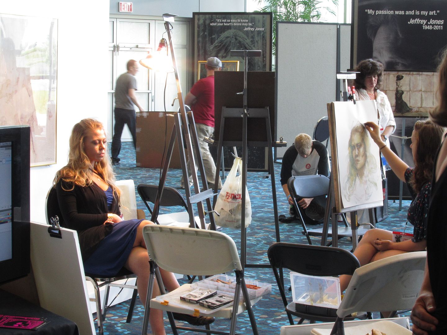
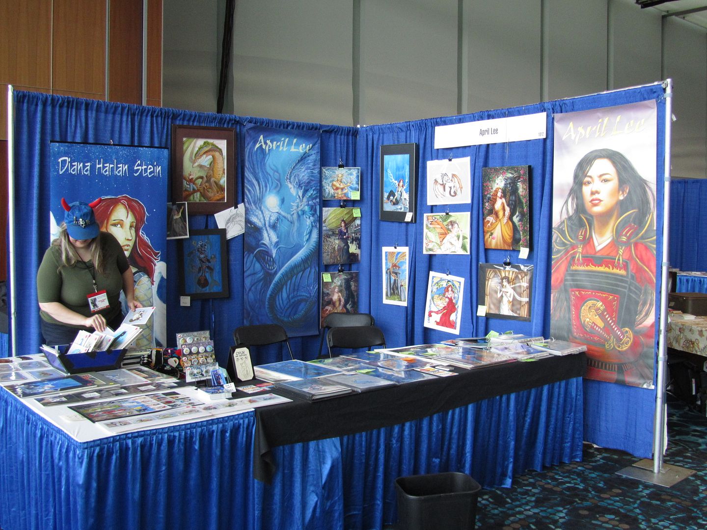
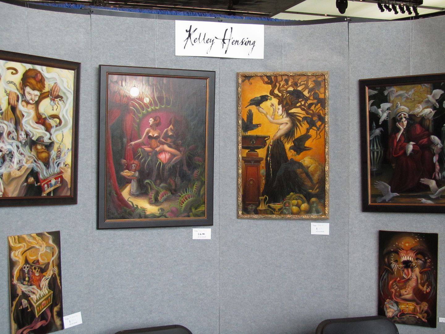
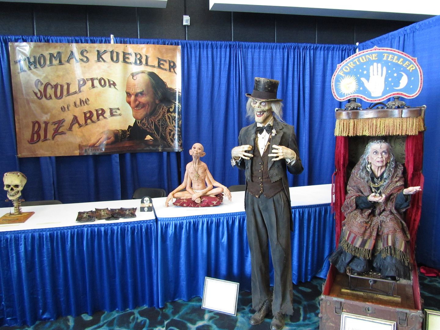
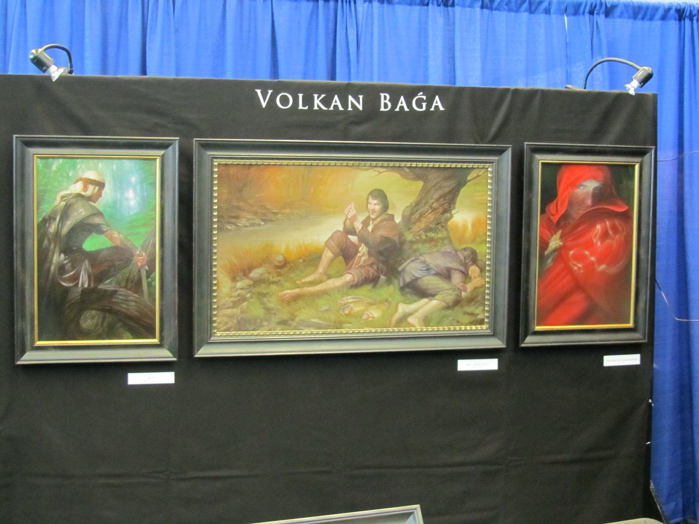
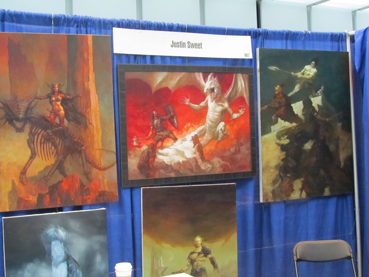
Yeah, I'm trying to catch up, which is just impossible for me... Anyway, back in MAY, the folks at the Spectrum: Best in Contemporary Fantastic Art series of art books held its first event in Kansas City, MO: Spectrum Fantastic Art Live!
Here's the website:
http://www.spectrumfantasticart.com/spectrumfantasticartlive/
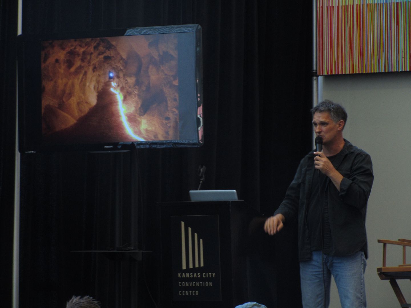
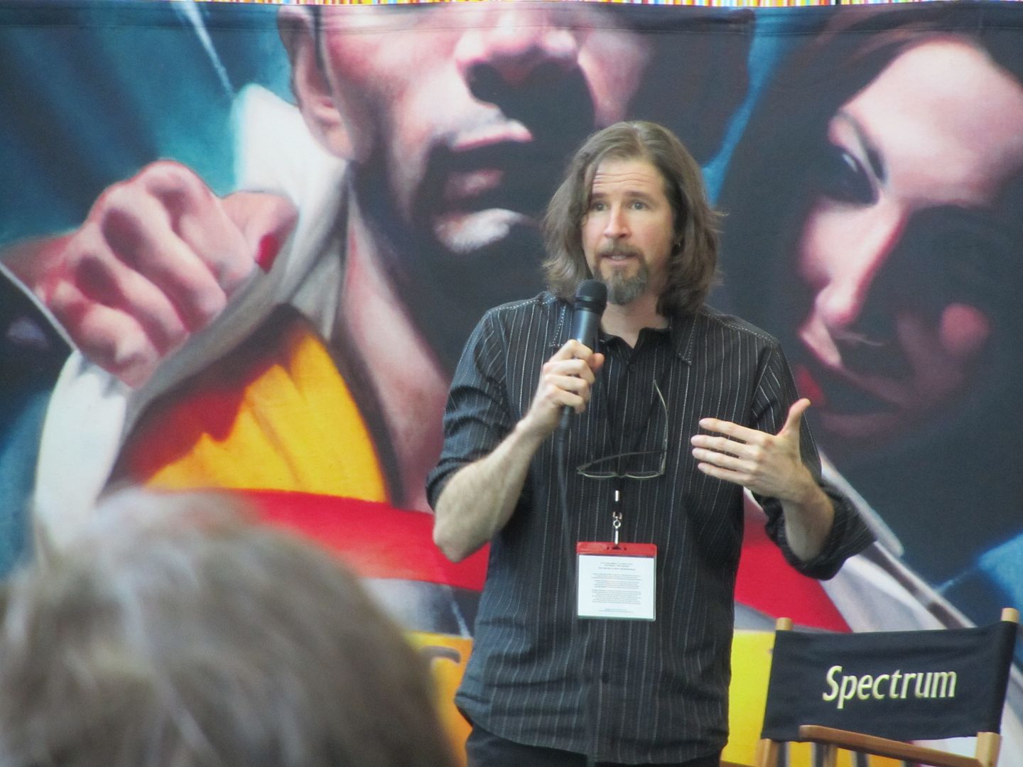
Brom was one of the special guests, he gave a slideshow overview of his career, which was, of course, fascinating--
Brom had lots of amusing stories about getting to work for TSR and his time there. From the outside it seemed like they must have loved having him there, shaking things up a bit and keeping the art interesting and fresh, but he thought management felt he wasn't quite fitting in with his muted palette and dark, edgy characters.
"the secret to making it cool: put an eyeball in a hand"
management: "your elf looks gay"
brom: "i posed for that"
gets called by the people doing Scooby Doo and goes he goes in thinking, "you want me to be Shaggy"
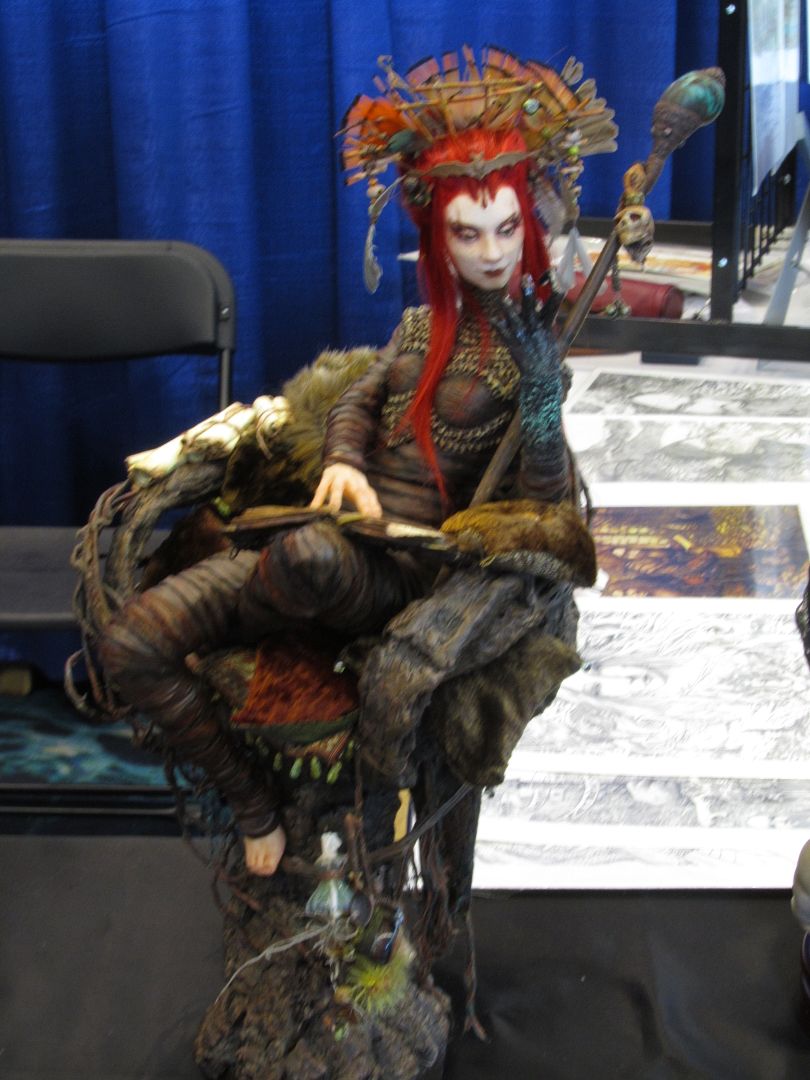
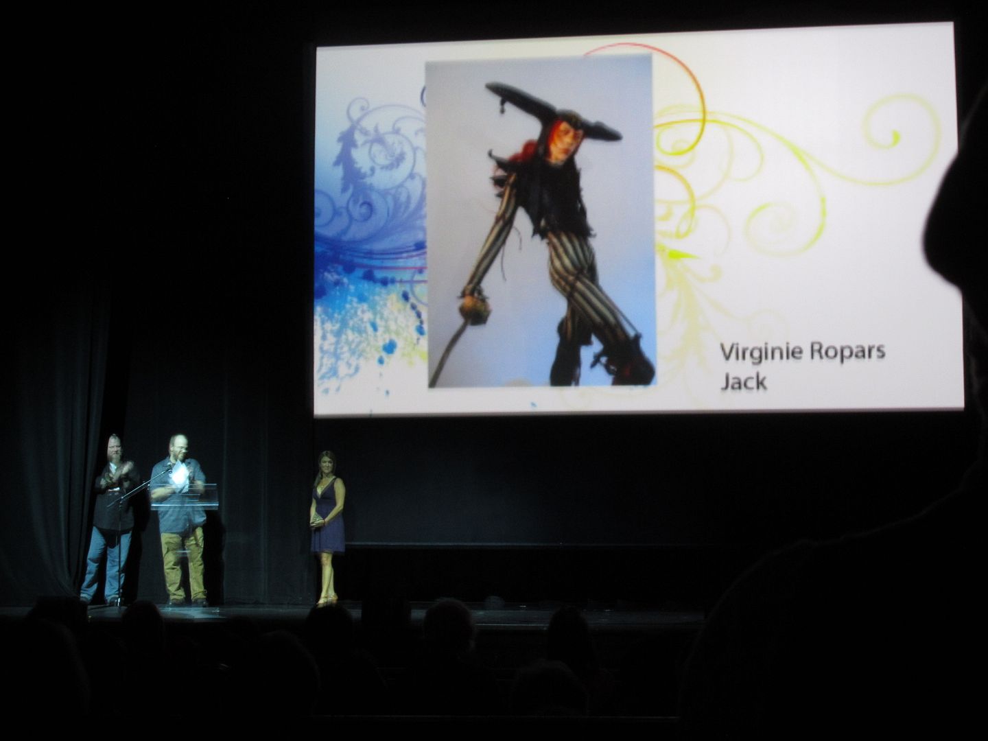
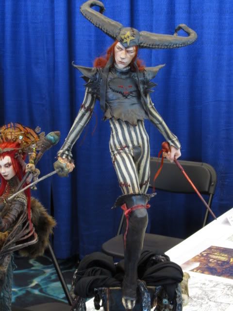
Sculpture by Virginie Ropars, based on Brom artwork--
... She won the Spectrum 19 Gold Award for Dimensional Art at the Awards Ceremony.
Another of Virginie Ropars' sculptures--
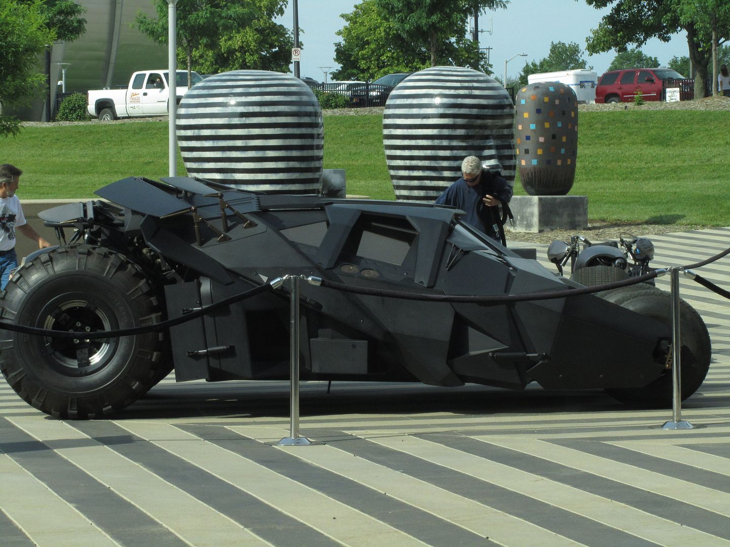
Batmobile displayed outside--
Random photo--
Special Guest Iain McCaig (creator of concept art for Darth Maul, etc.) gave several interesting presentations. I picked up one of his books and a sketch by him. Yay!
The Art Department had their booth across from ours--
Diana Harlan Stein and I shared a booth. It was by the stage where the Guests made their presentations, which was very cool I got to see them all. There were also panel discussions, but I missed those.
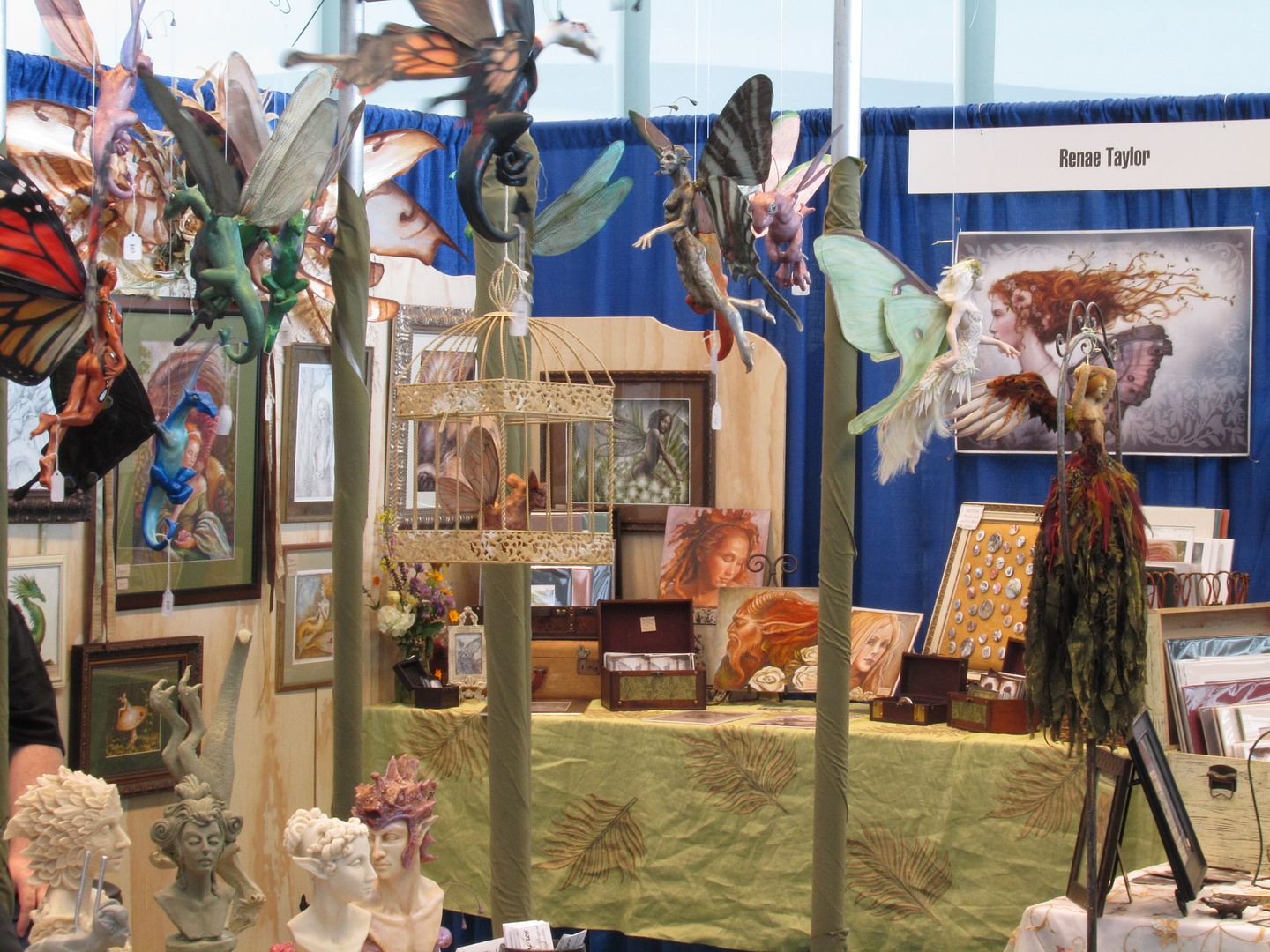
More random booth photos--
Spectrum Art Awards--held in a fabulous old theater. Announcing the nominees for Best Dimension Art, Virginie Ropars, winner of the Gold.
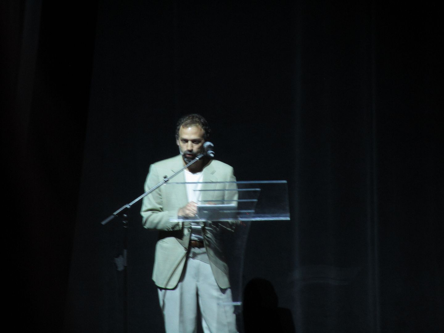
Spectrum Art Awards. Donato Giancola, one of the presenters.
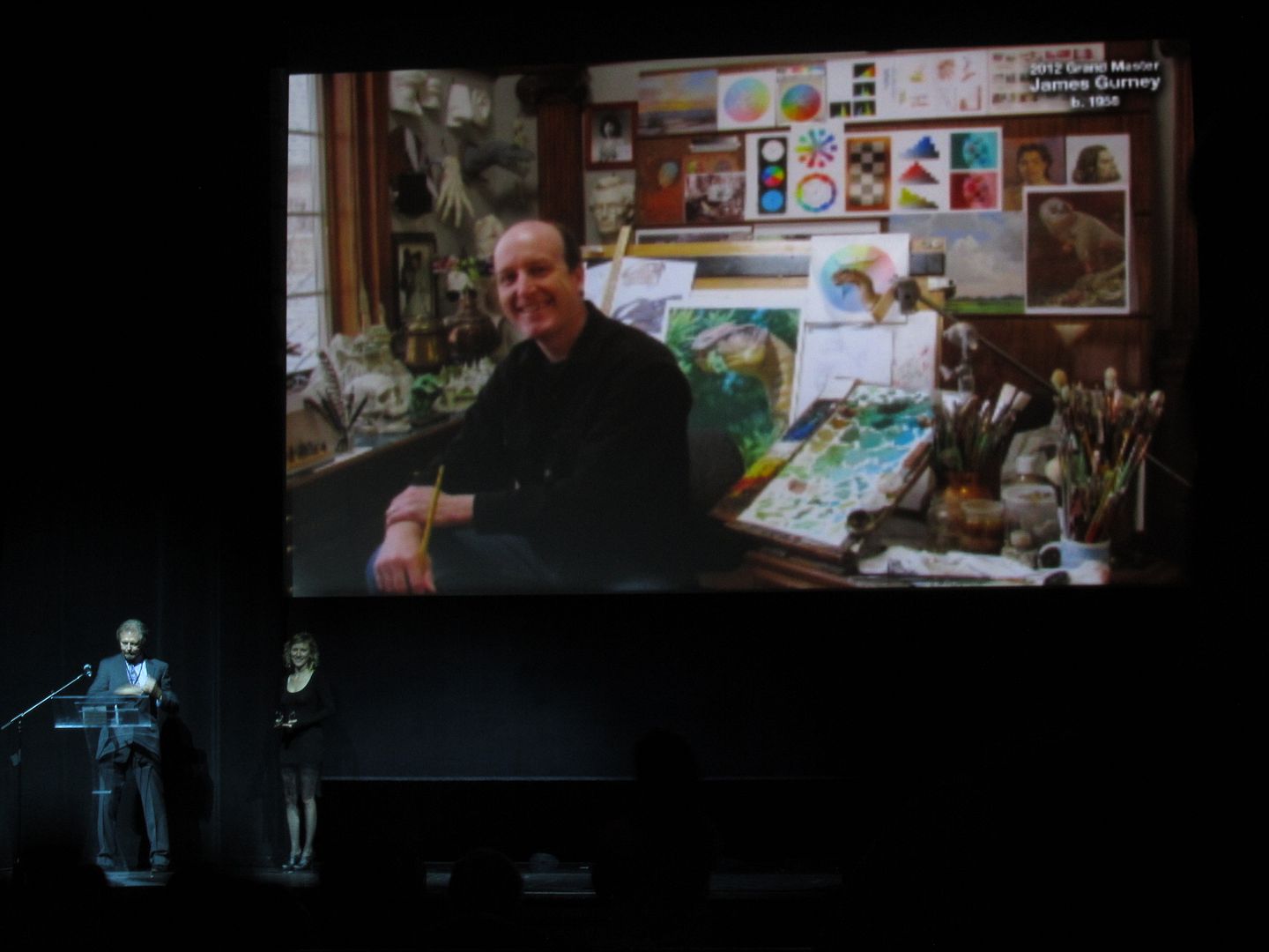
Spectrum Art Awards. Michael Whelan announcing Grand Master award given to James Gurney--
James Gurney was there to accept (as were most of the artists. He also gave presentations during the day, and had a booth where he did demos.
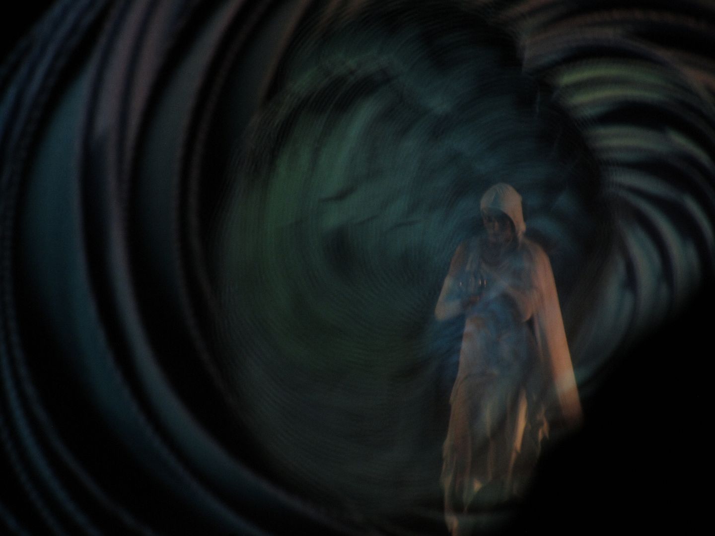
Cool dance/art show between the awards, by the Quixtotic Fusion dance company with Android Jones (one of the Special Guests)--
The hotel bar was buzzing afterwards. Exhibitors I heard from reported "Eh" or "OK" sales, but were enjoying other aspects of the event. That was pretty much my experience, too. The show and the Awards Ceremony were well-organized and definitely worth going attending.
It was announced that Spectrum will try it again next year.
“If we shadows have offended, Know but this and all is mended. That you have but slumbered here, While these visions did appear, And this weak and idle theme, No more yielding, but a dream.” ― William Shakespeare, A Midsummer Night's Dream
Sunday, July 29, 2012
Saturday, June 30, 2012
IMC: Last photos, student work, etc.
Here's the last few photos from IMC...
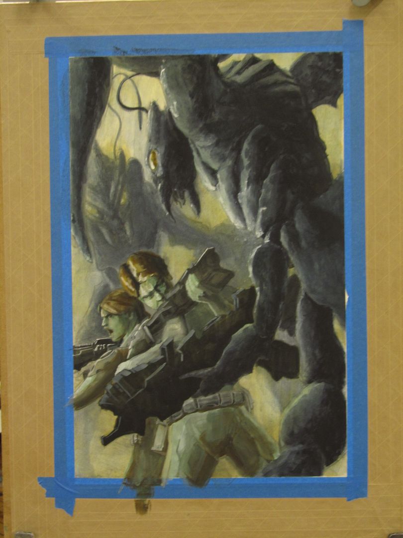
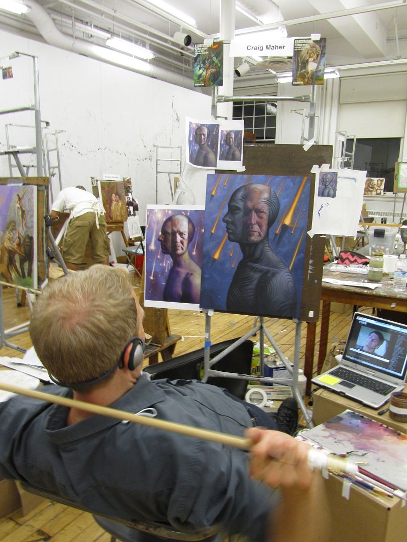
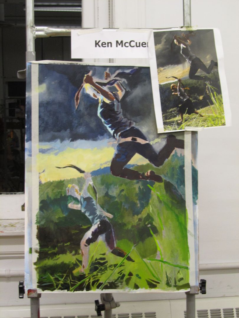
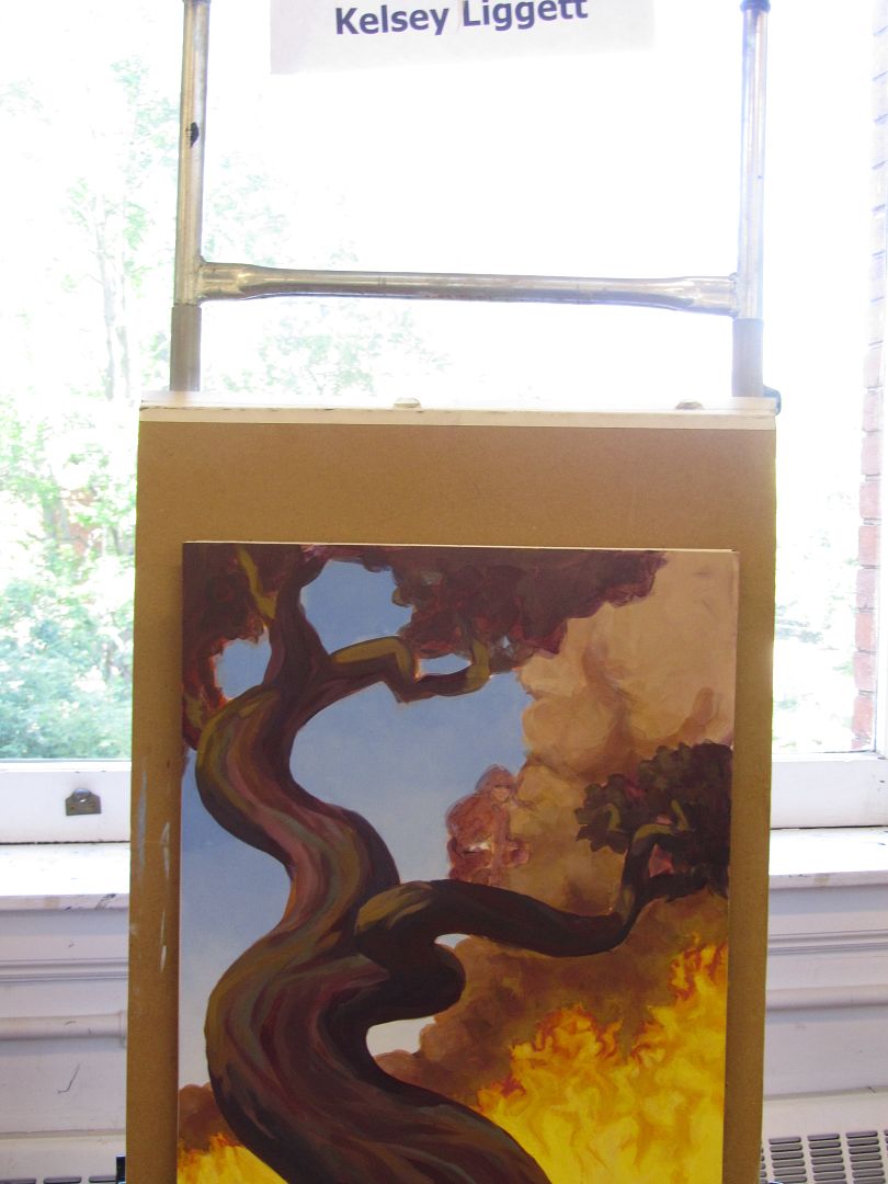
The students are seriously amazing (even the ones who are just starting out, since all levels are able to come). There are Art Directors who are doing the class, as well as working artists and hobbyists and people who are doing something else but want to get into art, and art students. And there have already been success stories--students who have furthered their careers and who are getting into Spectrum and getting jobs. There are students who have started their own art workshops. And those who are just happy to hang out in an artistic atmosphere for a week.
..
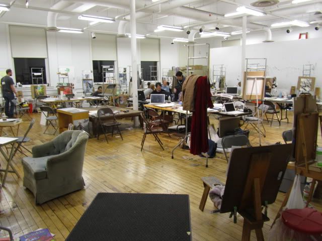
There are two large painting studios, plus the digital room. I usually take the downstairs studio because I don't like taking the stairs to the upstairs room. Here's the downstairs studio where we set up our station and work on our pieces. Half of the instructors are set up along the wall to the left, where some are painting and some aren't...
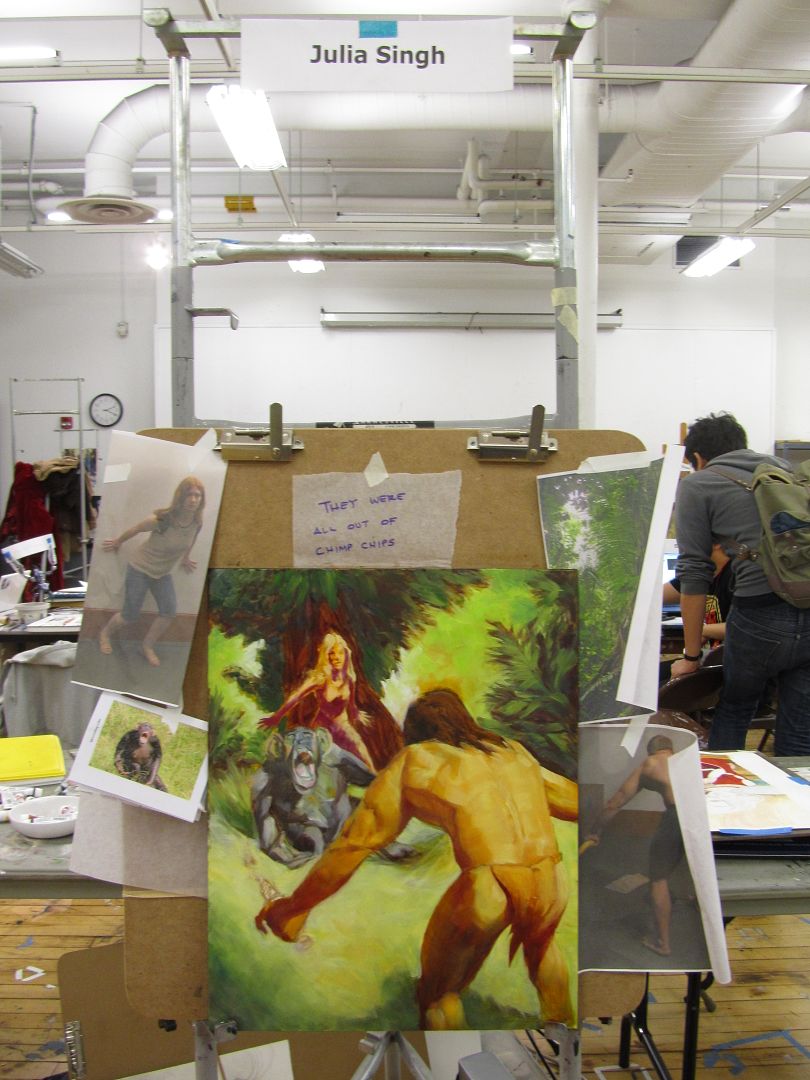
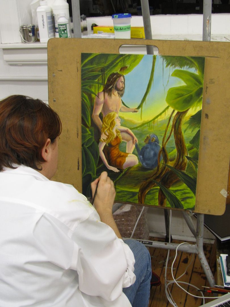
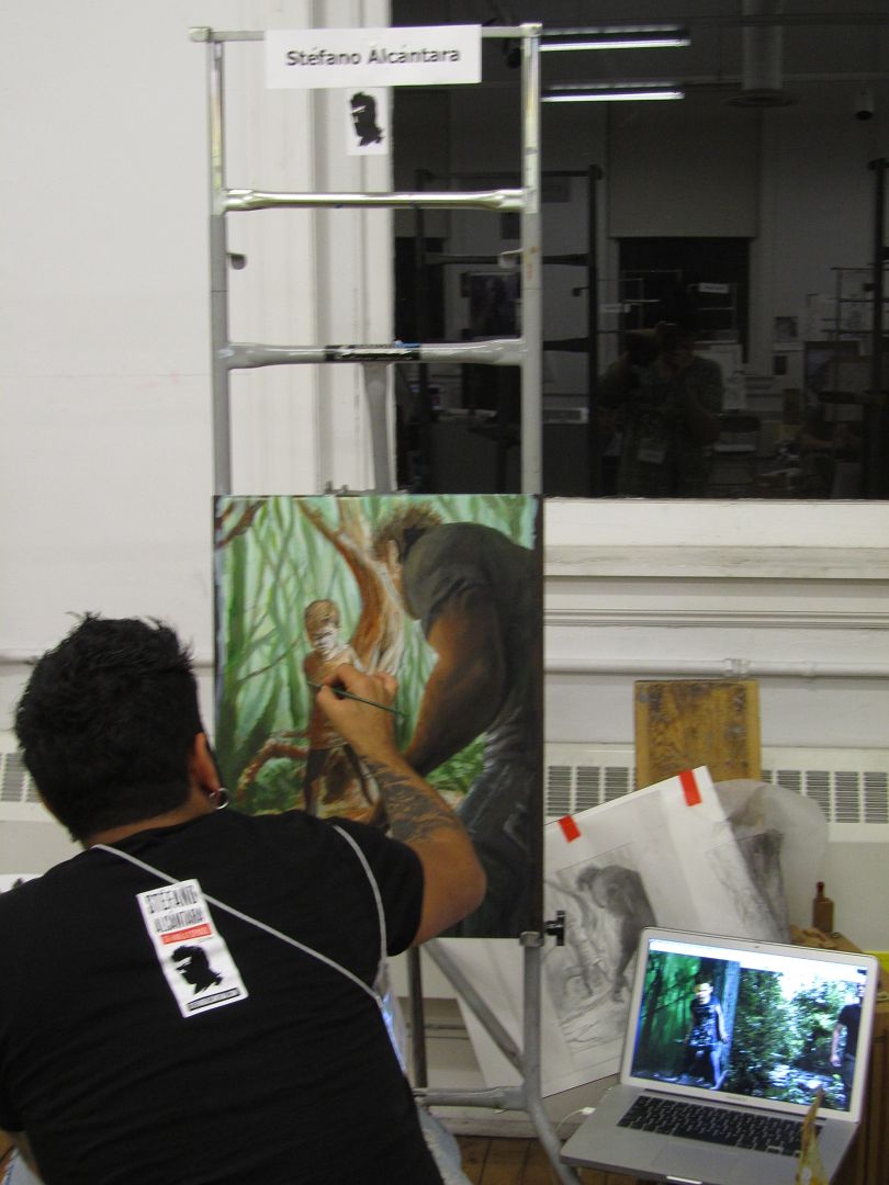
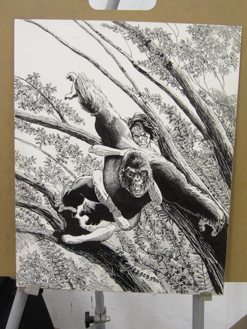
Tarzan was a popular choice for the assignment--
Old Man's War, SF assignment.
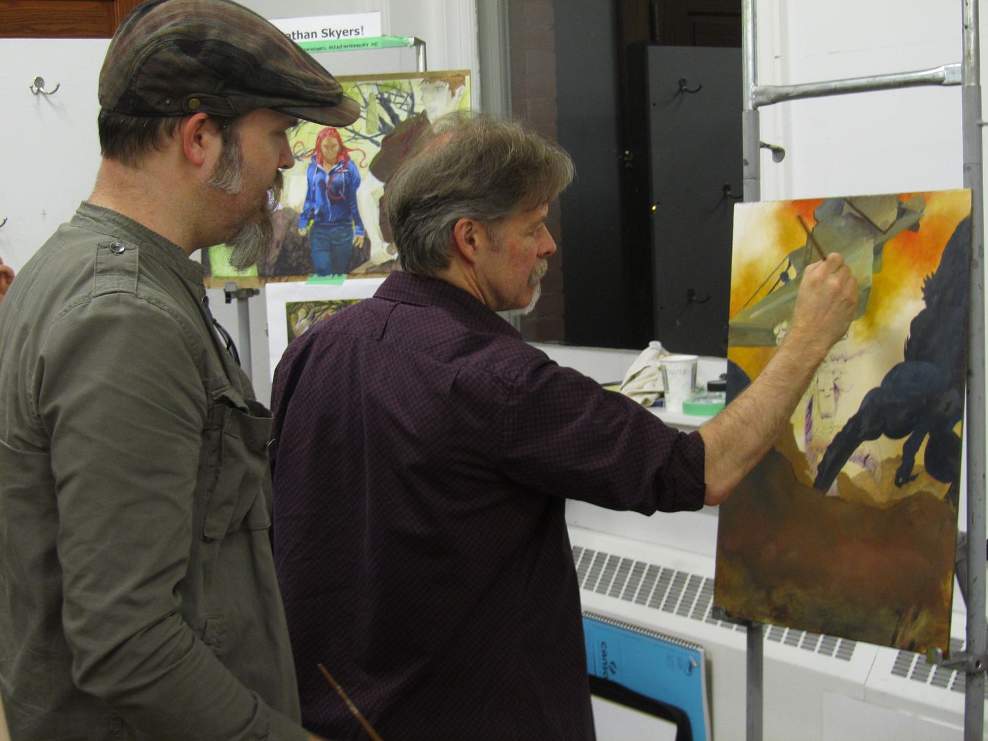
Here's Scott Fischer and Greg Manchess painting on someone's spaceship... I know this can freak some people out, but it's fun, really, to watch these guys in action. They aren't slopping stuff over someone's hard work, they are doing little things to something that hasn't been worked on... and the student is free to paint over it if they don't like it. I wouldn't mind having people paint on my painting in this way. I mean--these guys know what they are doing and can really help things out and give you ideas. And they DO ask first!
Hunger Games assignment--
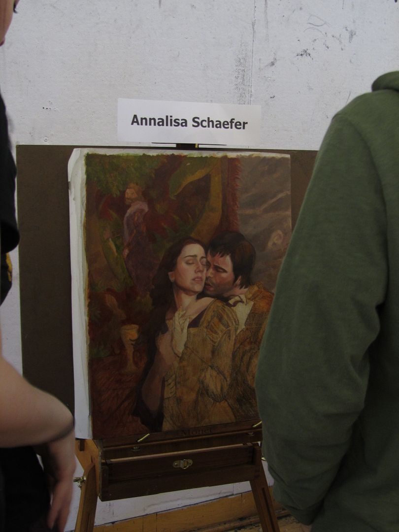
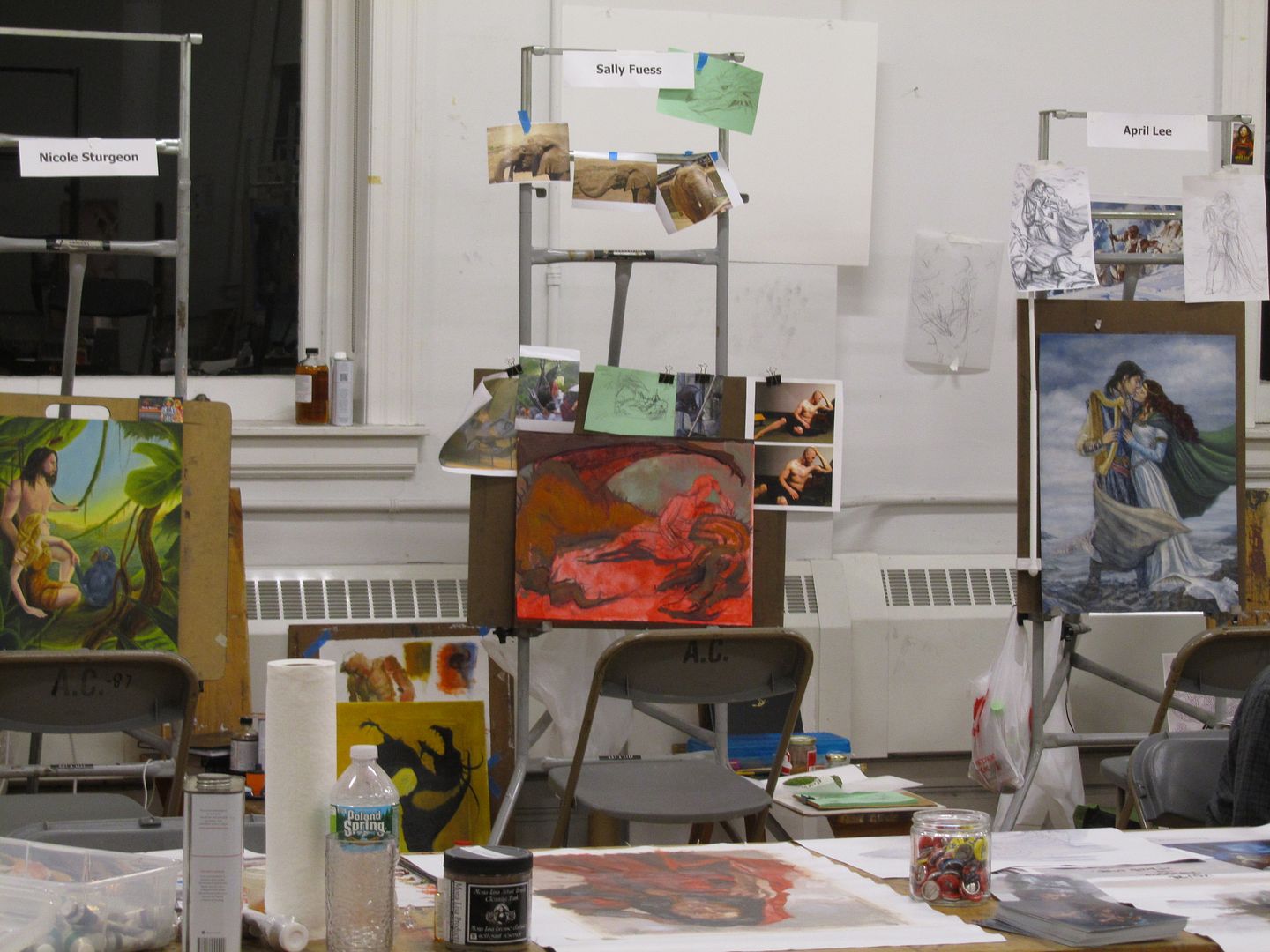
Tristan and Isolde fantasy assignment--
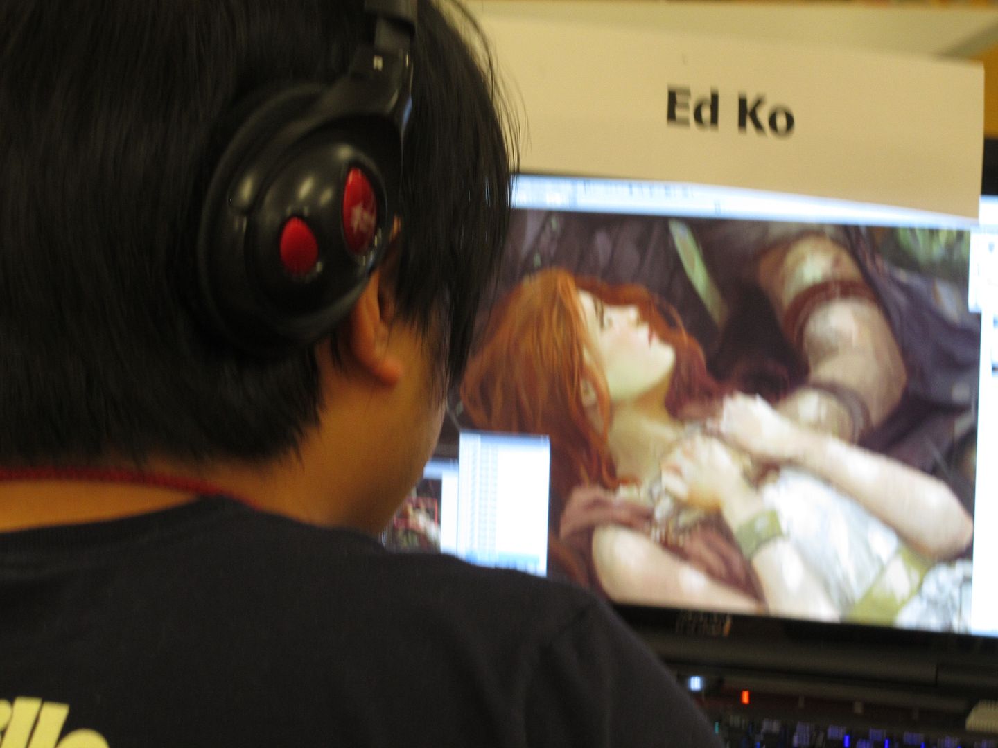
Not all digital had to be in the digital room, this (amazing!) guy was downstairs--
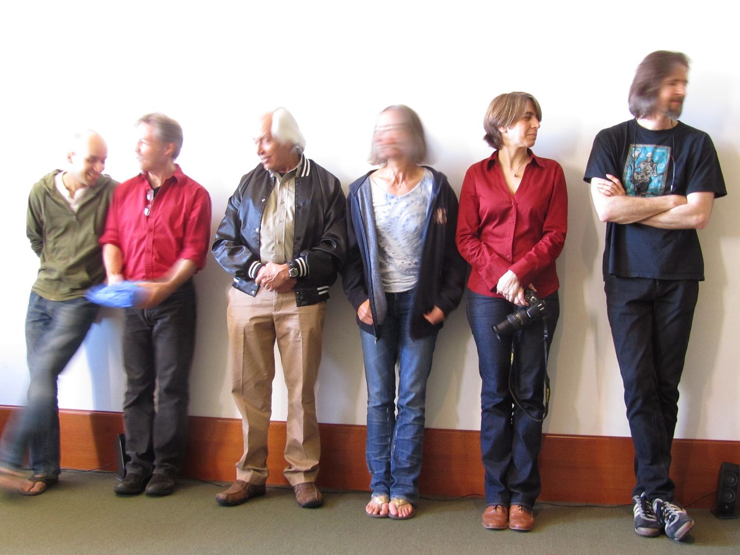
Up Against the Wall! The Usual Suspects! No... some of the instructors at the Closing session... Great images of the week in the presentation. And gifts given out as thanks for help and for the instructors from the students.
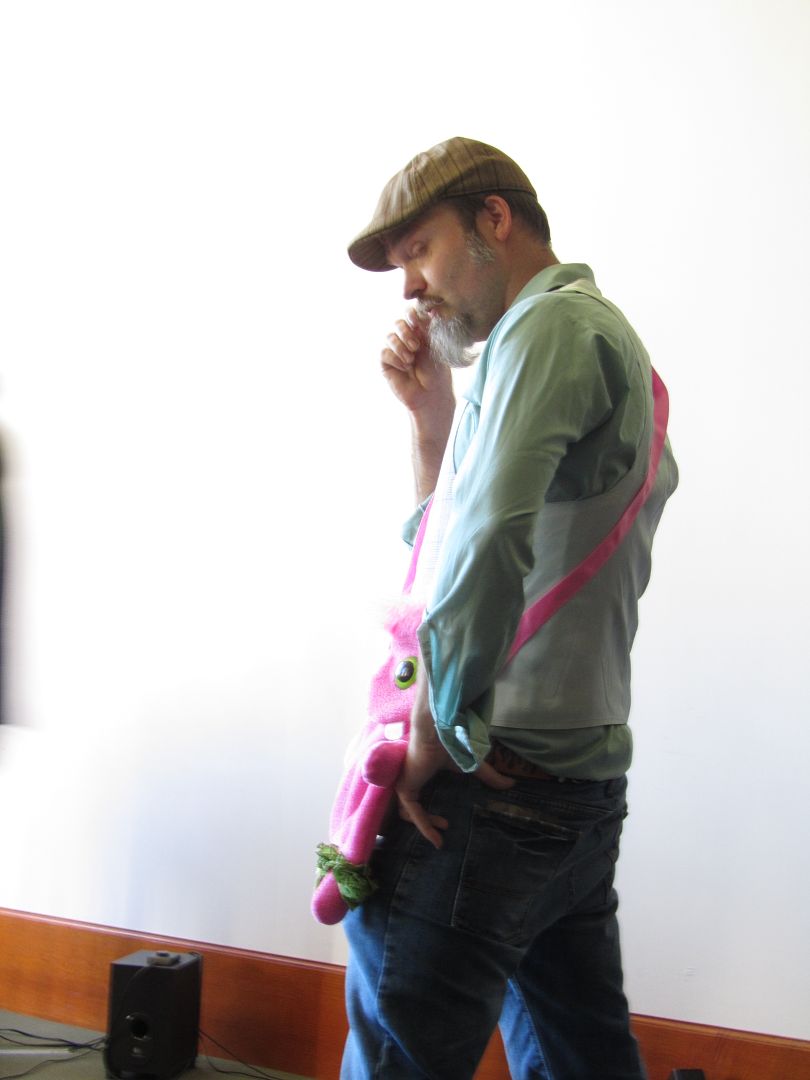
Scott showing off his gift (they were hilarious! hand-made bags... his was the only pink one... well, the DOES do children's book illustration...!)
Afterwards--we clean up the studios. Have our paintings on display. And do lots of sketches in the sketchbooks. Everyone does. I got Boris to sketch in my book this year--
But it's lots of student/student sketching... which continues at the High Horse bar in Amherst...
And all night at the dorm...
No photos... I've turned in by then! Needed to pack and get up early for the shuttle in the morning!
But another IMC gone--but not forgotten.
Seriously... if you're into fantasy art at all, I highly recommend checking this out!
Monday, June 25, 2012
IMC: My Painting
For the IMC (Illustration Master Class), there are always cool choices for the assignment. This year there was the High Fantasy: "Tristan and Isolde", the SF: "Old Man's War by Scalzi, movie tie-ins: "Tarzan" and "The Hunger Games", and a YA short story about a boy and a ghost.
I've always chosen the fantasy assignment. At this stage of my life, I'm more interested in doing things for myself and I prefer to concentrate on fantasy images. Although Tarzan was tempting. But I liked the costumes and romance of "Tristan and Isolde."
I worked up several sketches--all sadly pretty similar, of a couple, full-figures. I'm afraid I had a pretty set idea of what I wanted, the poses just varied slightly. I didn't do thumbnails (bad me), and I didn't draw boxes around the sketches (I use the page size as the box (again, bad me).
Here's the sketch my instructors (for the crit: Rebecca Guay, Dan dos Santos, Greg Manchess and Iain McCaig) chose:
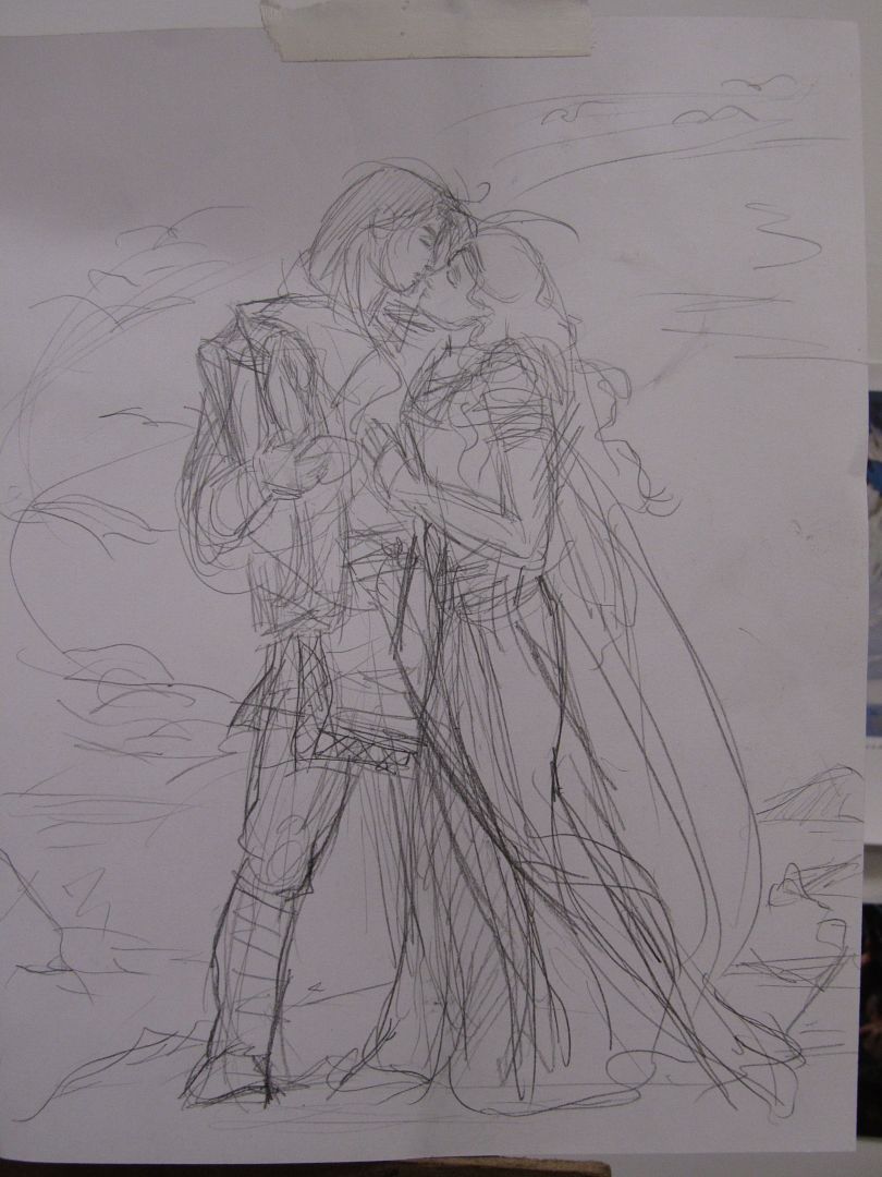
And yes, it's very romance-y. I was looking at romance book covers... Oh, well...
Rebecca said: You have almost a straight line dividing the couple. NEVER do that.
Then somebody suggested that I could bring Tristan's cape in front of them to break the line. Or visa-versa, Isolde's cape flowing in front. And another suggested that I could have Isolde's (or Tristan's) cape flying out more.
They took tracing paper and sketched it. And then flipped it.
After the crit, Scott Fischer came by and suggested I lean Isolde into Tristan more. (I drew darker lines on the sketch to see where she should lean in her body more). And I caught Julie Bell to ask her if the sort of "A" shape of the couple was OK, and she said to go for it.
I rather crudely re-worked the sketch like this--
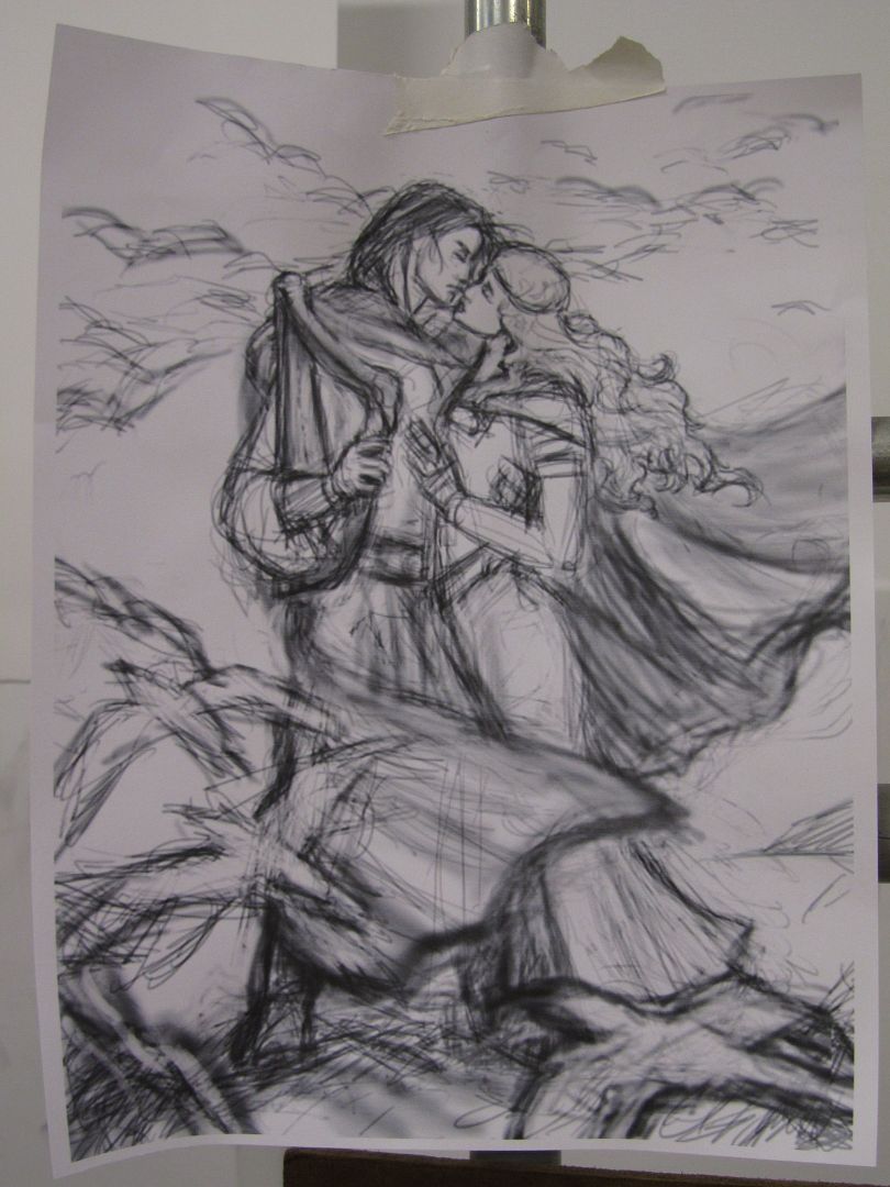
I'd always been meaning to have birds flying around them. Someone had suggested the birds flying away, and I liked that... (I thought, as if their love was fleeting, flying off, doomed, right?)
I then went off to work up the piece in photoshop, taking bits from images. I also took ref. photos, but not too seriously (bad, bad me). That took a day! But I was also working out color and values that way. And getting reference.
I took my file in b&w to the copy shop to get it enlarged to 18"x24" to fit my masonite (clayboard) the next morning... ok, so next afternoon! After the 10 lecture and lunch...
And I spent the afternoon wet-mounting it (the Donato transfer method!). I used semi-gloss medium instead of matte, and since I wasn't sanding between layers because I was in a hurry and didn't have sand paper anyway, it was a super-slick surface! bleh...
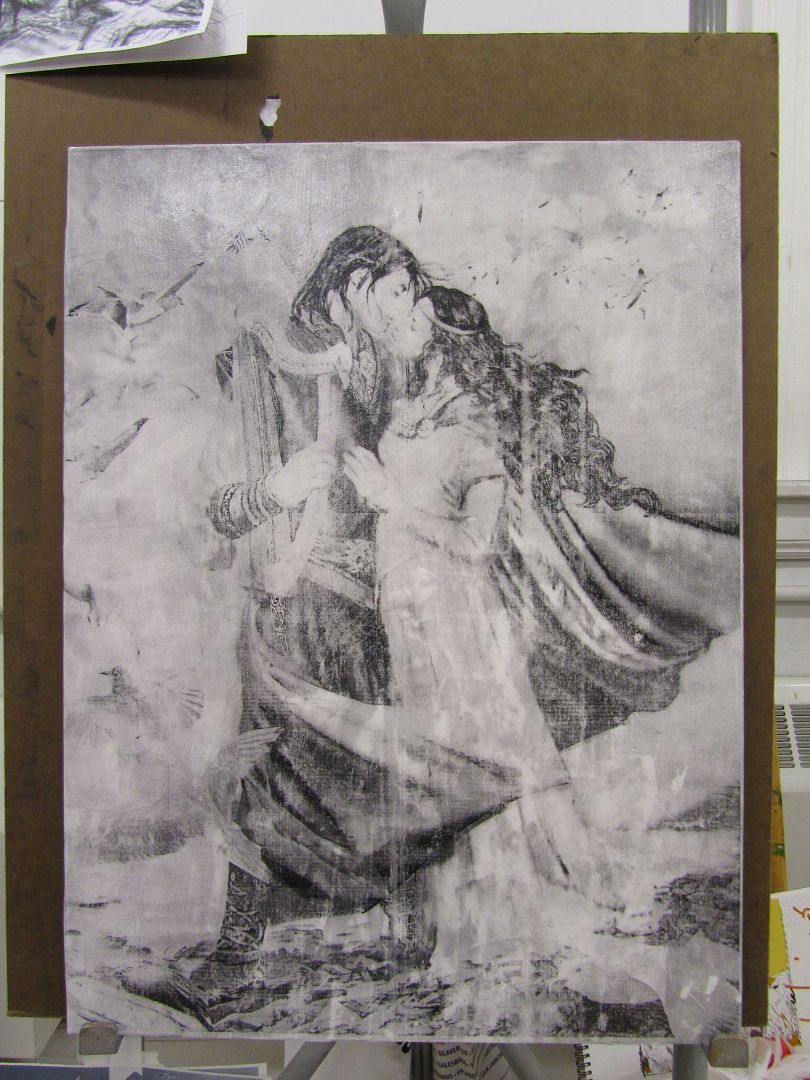
The toner was crap and lots of it washed away with the water and medium. bleh.
But I can work under idea conditions! I did a quick value/base-color underpainting in acrylic (ultramarine blue... I just favor that, or burnt umber if I'm doing a warmer colored painting). The acrylic stuck well to the slick medium and helped that a bit.
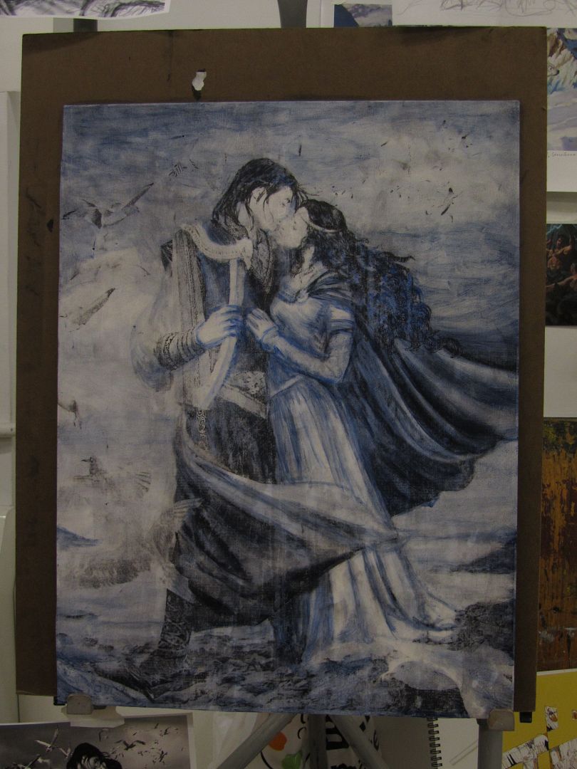
hmmm... not much change here... Anyway... acrylic underpainting-- good because it dries quickly, also good because I had barely let the medium and board dry out. I quit painting for the night and let it dry out so I could start with the oils in the morning.
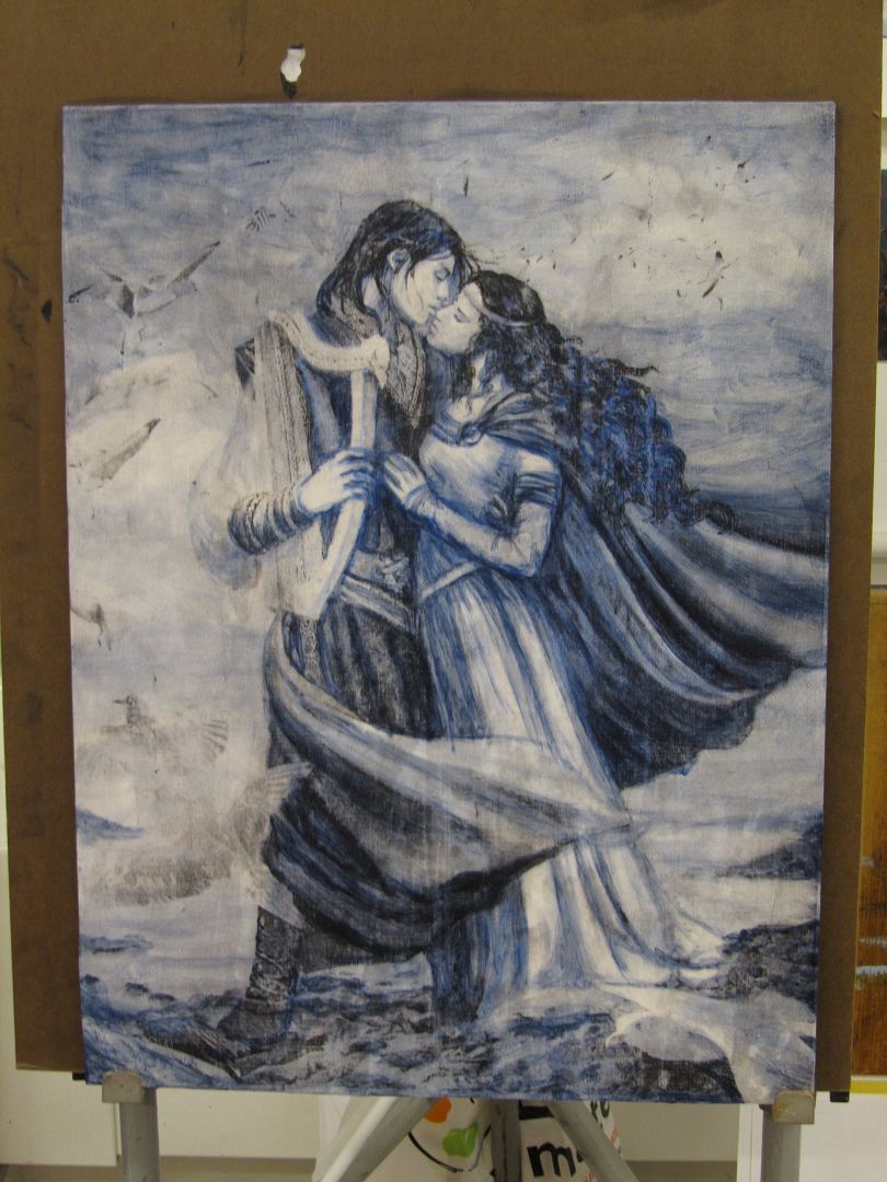
So... only two days to paint! Aggh. Laid out my palette-- using plastic wrap from my masonite board taped around my sketch book because I forgot my palette paper... And quickly started slapping paint on (very thinly with tiny brushes, though, to keep it from getting goopy and hard to work with and bearing in mind that I had to pack the painting up in a few days to get it home and didn't want sopping thick oil paints to mooosh everywhere!).
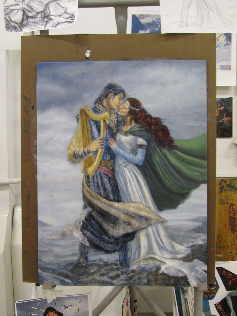
Greg Manchess dropped by to say he'd make the birds behind Tristan only go to shoulder level, which sounded good to me. I'll have to try and recall that when I actually get around to the birds. Will need to dig up better refs... the ones I dug up for my photoshopped image were pretty awful.
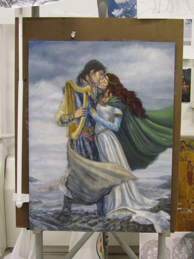
I got rid of the darks in T's cape... not sure if I like it more neutral or not. Might go back and darken it later, for more drama. Might look better to be dark towards the bottom, anyway...
Also discovered that I was using the crappy kind of Turpenoid. Dan dos Santos said the "Natural" Turpenoid wasn't like regular Turpenoid... it took forever to dry and remained a pile of goop instead of evaporating away. I borrowed some... Gamsol? I think, from Nicole, and it was nice! I'll have to get some of that.
"Natural" Turpenoid is a bit easier to carry in luggage... but I'll have to try and work around that the next time, I guess!
Anyway, I now had more fears of a smooshed painting... so my painting pretty much slowed down after that.
Oh, and Boris came by and said I had to move Tristan's arm up... and he was right--it was way too low!
I'd already tried to move it up, but he said it need to be moved up more...
Julie Bell came by and I asked her if I should stick with my original plans to make Tristan's tunic brown and she said to go for it...
Check out my cool maul stick (below). It's a collapsible magnetic towel bar from Target--and it sticks to the metal easels here! (I find this pretty funny... some day I will get a real maul stick.) --for those of you who don't use oils--they remain wet so you need something like this to rest your hand on for detail work.
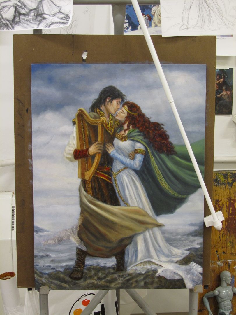
Eh, I got pretty far... I can see where I'm going with it, anyway, which is the important part.
I think i need to move his belts up, too. *sigh* And I was reminded to make sure the highlights and lowlights in her hair weren't all so even...
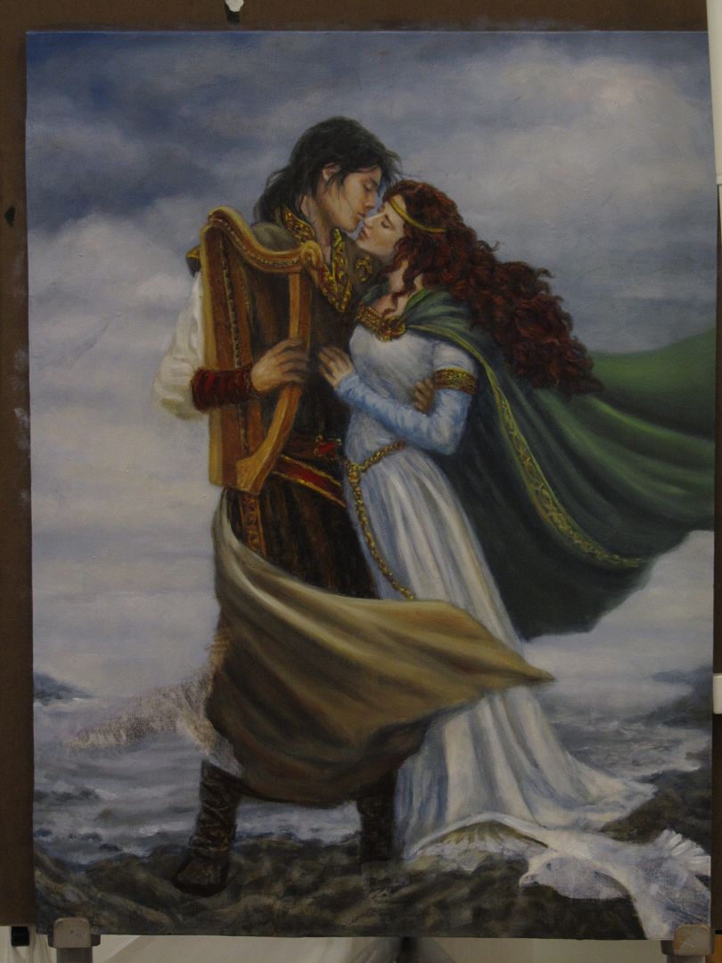
Trip home... the portfolio case doesn't show up on the carousel, so I go to talk to the Baggage folk for American. They manage to dig it up, to my relief. It had come in on an earlier plane. And my painting was mostly un-smooshed. A bit up in the sky got mashed a bit, but that's an easy fix! Yay.
Saturday, June 23, 2012
IMC-- Iain McCaig mini-demo
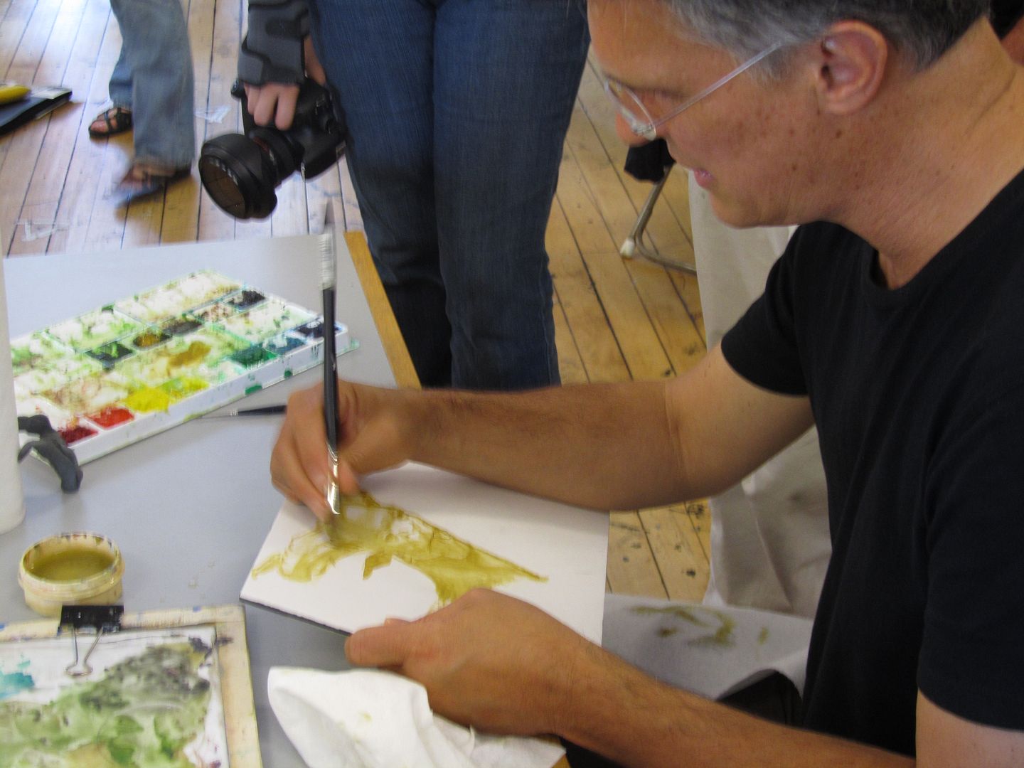
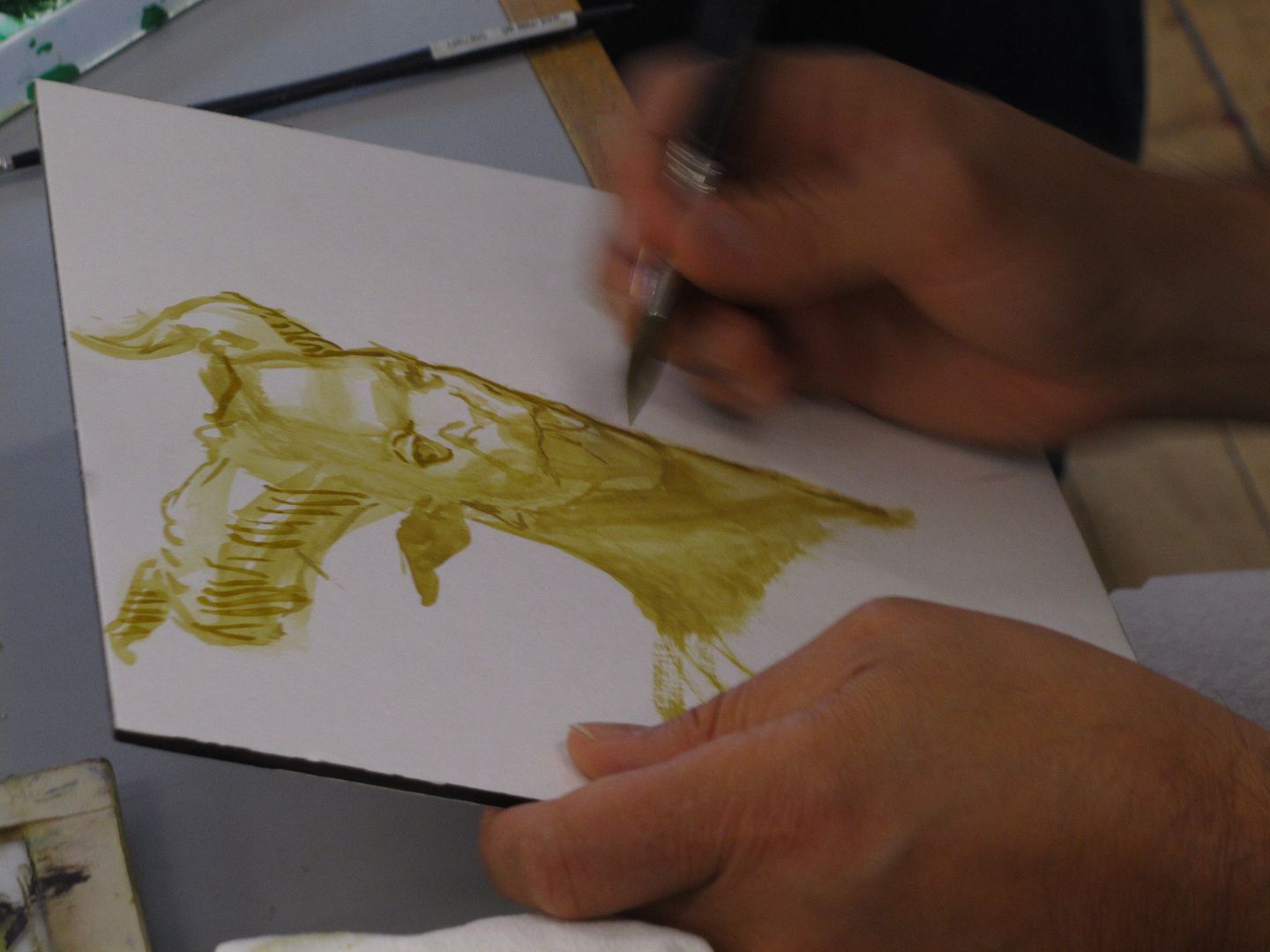
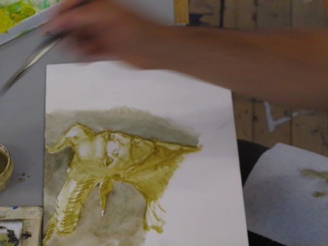
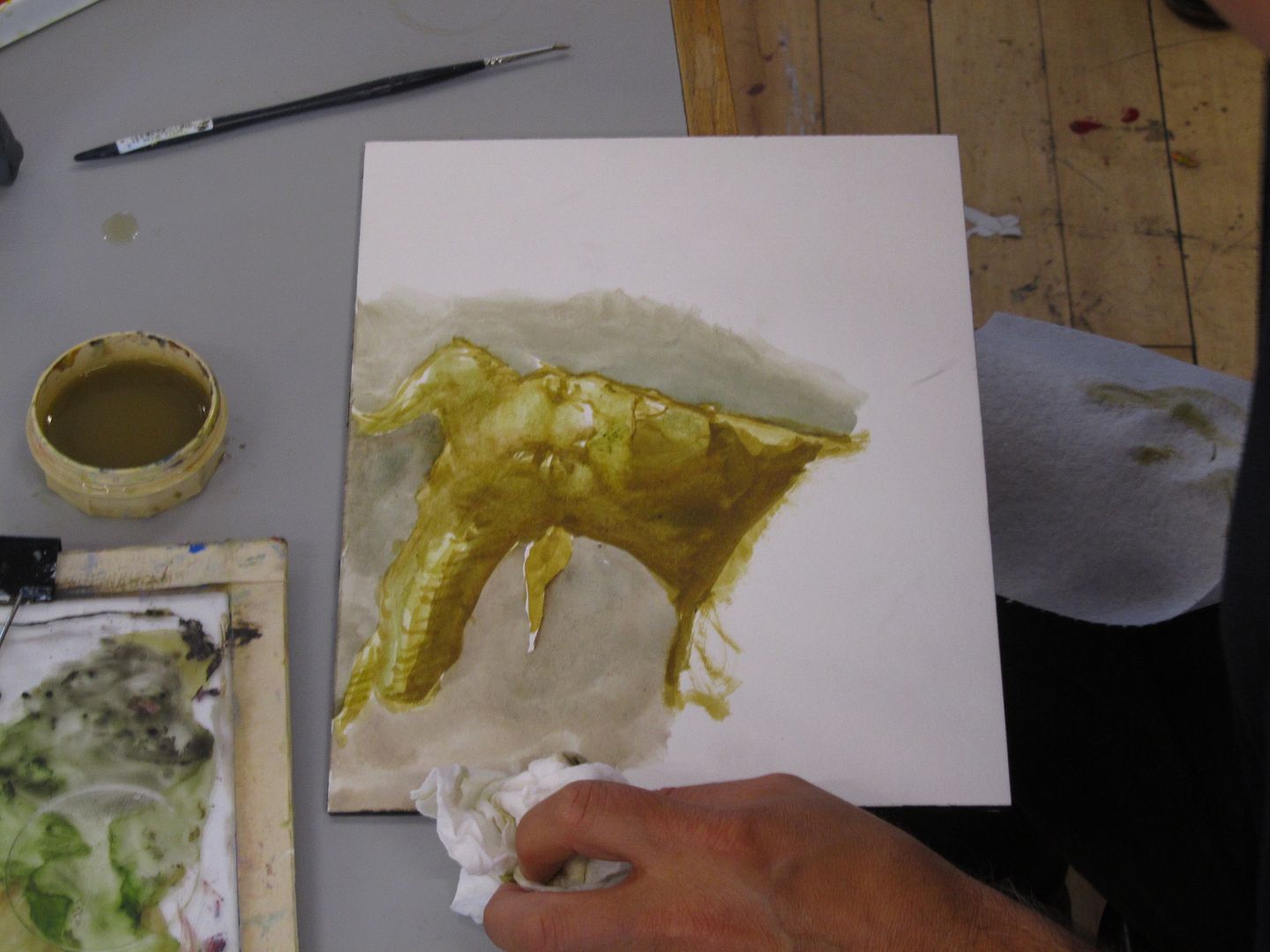
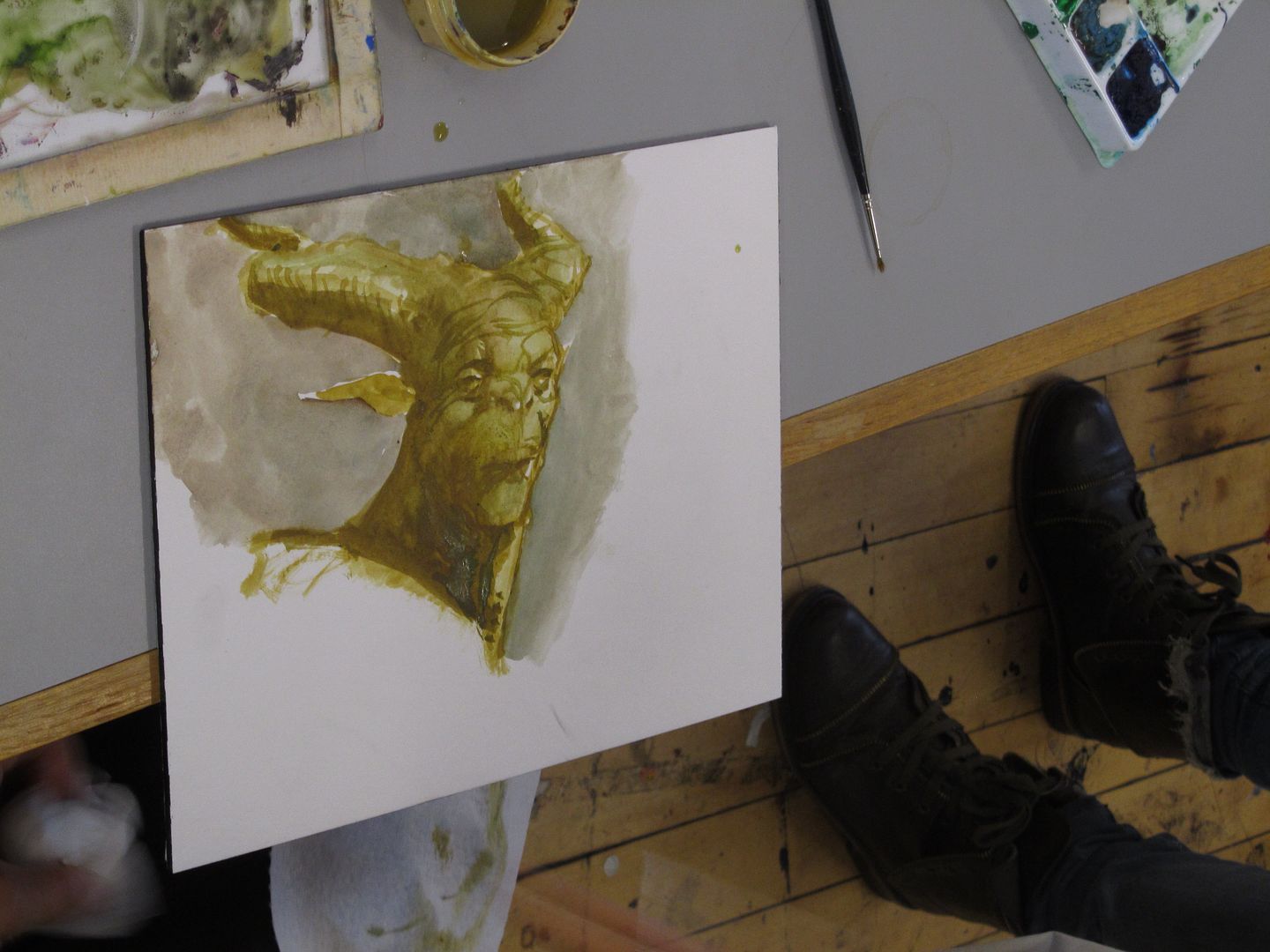
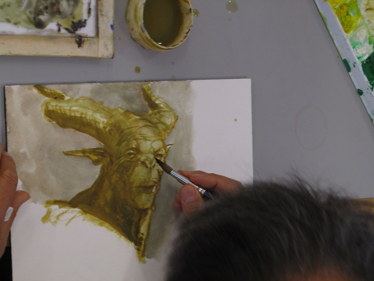
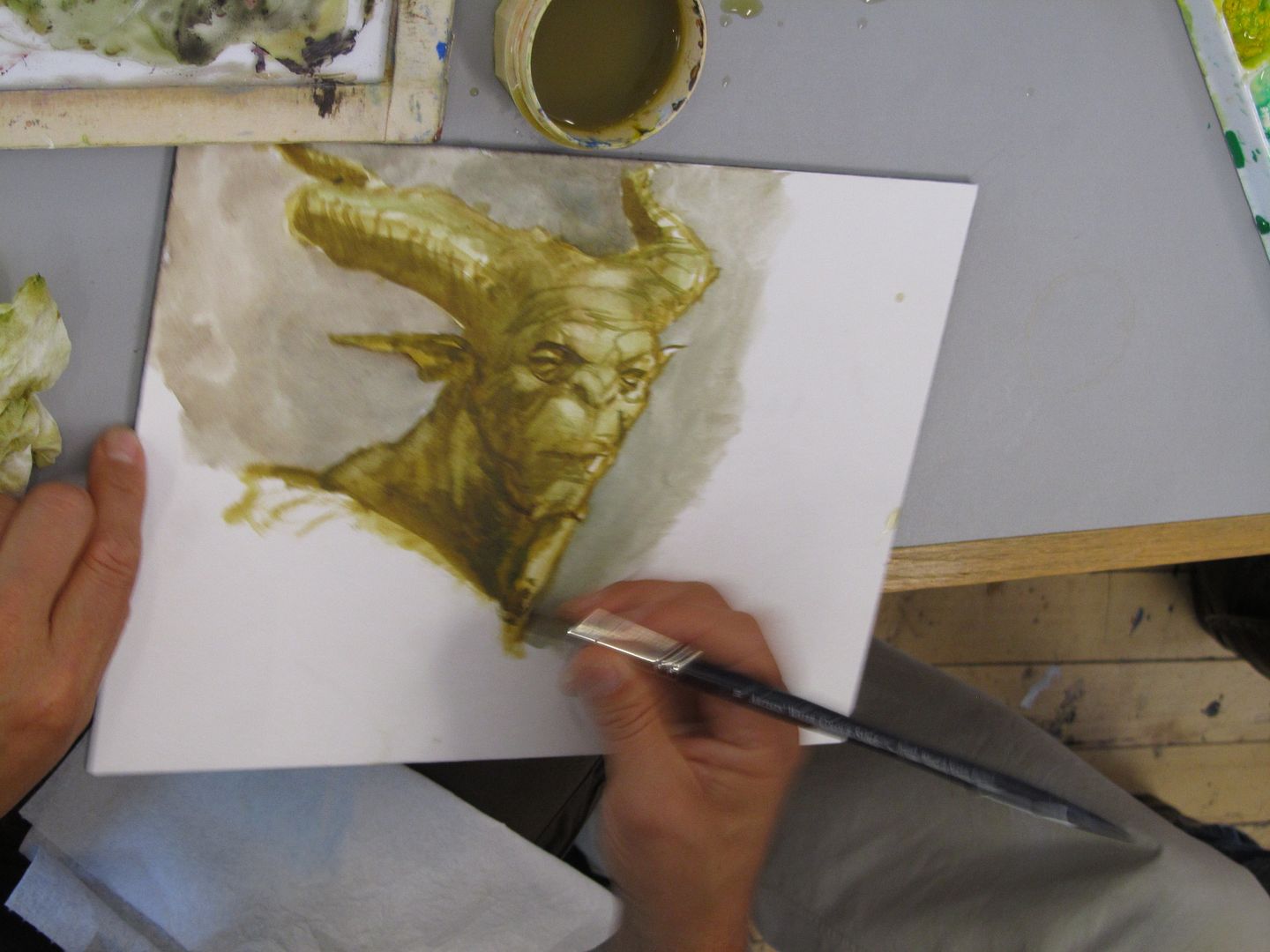
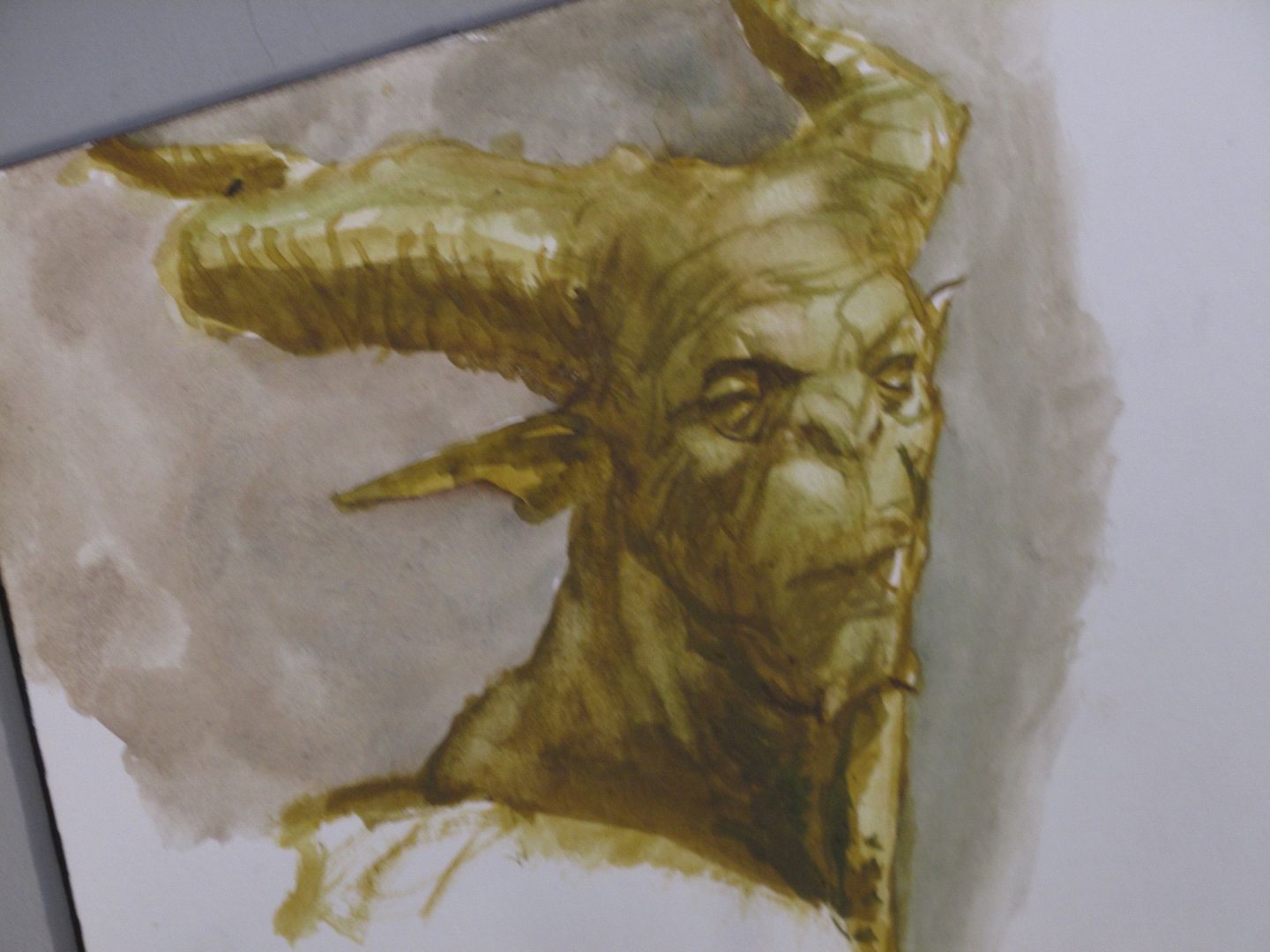
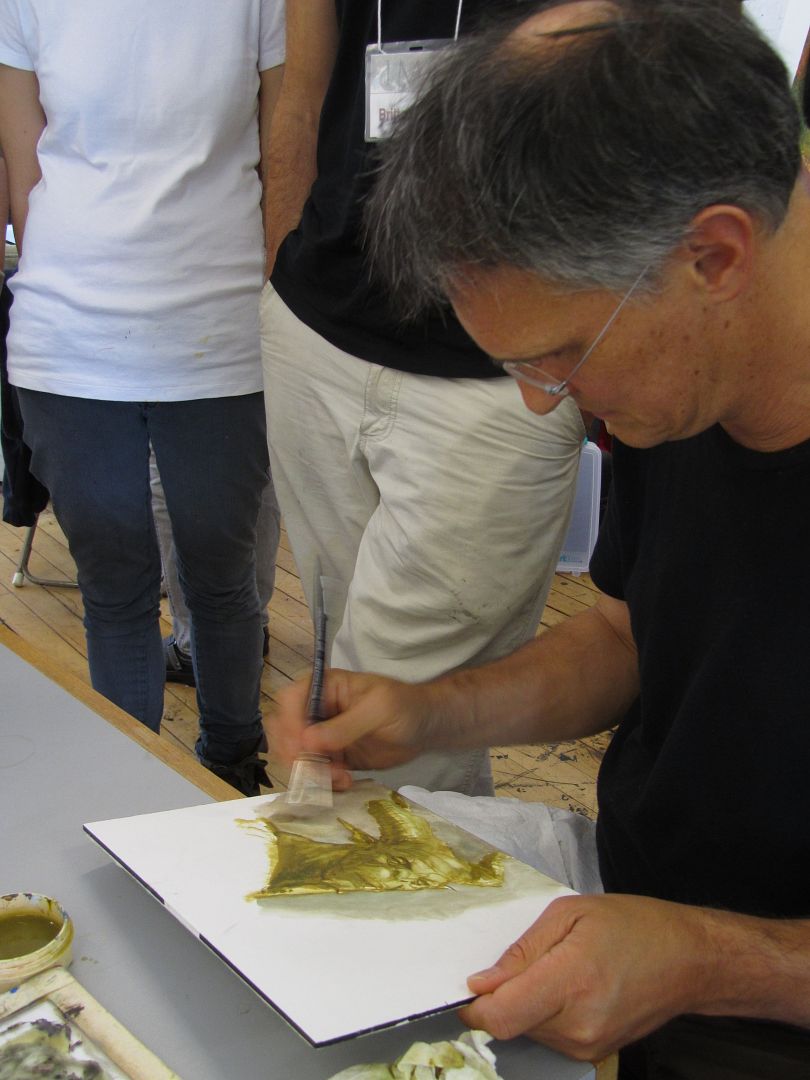
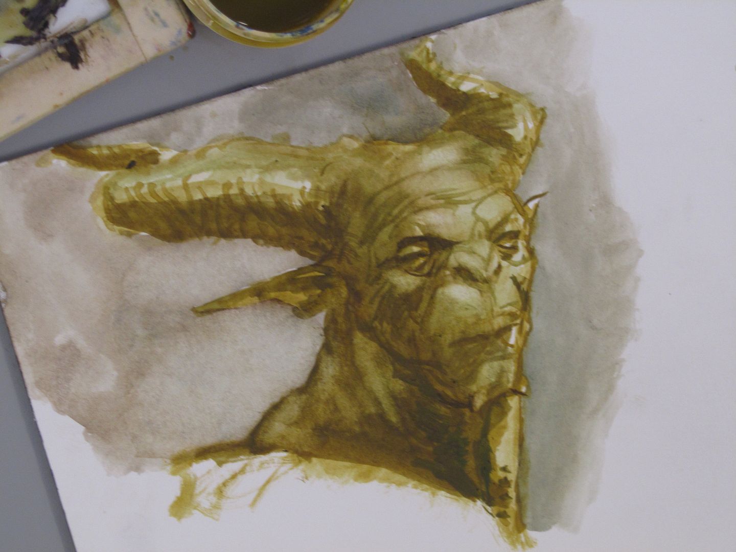
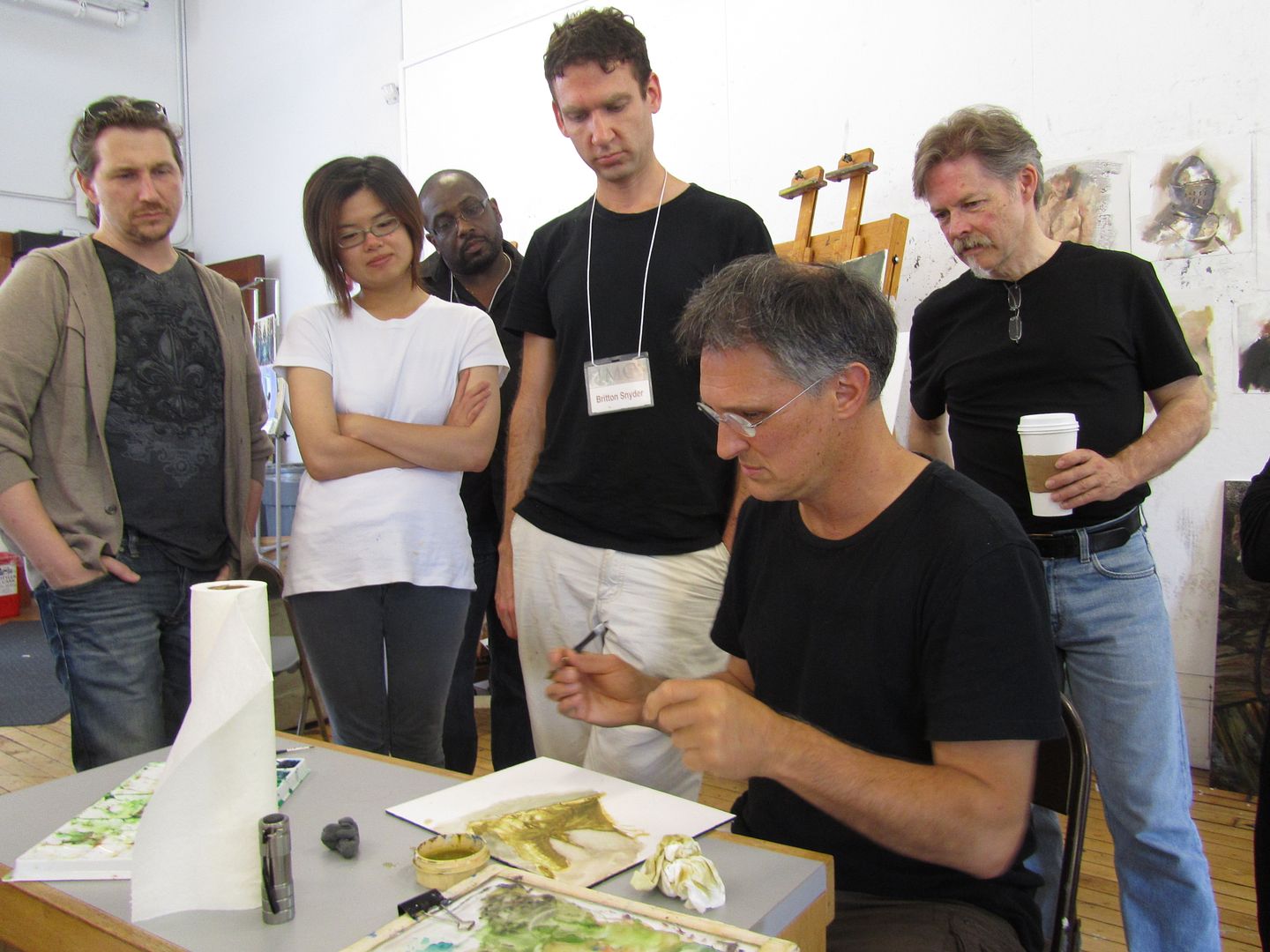
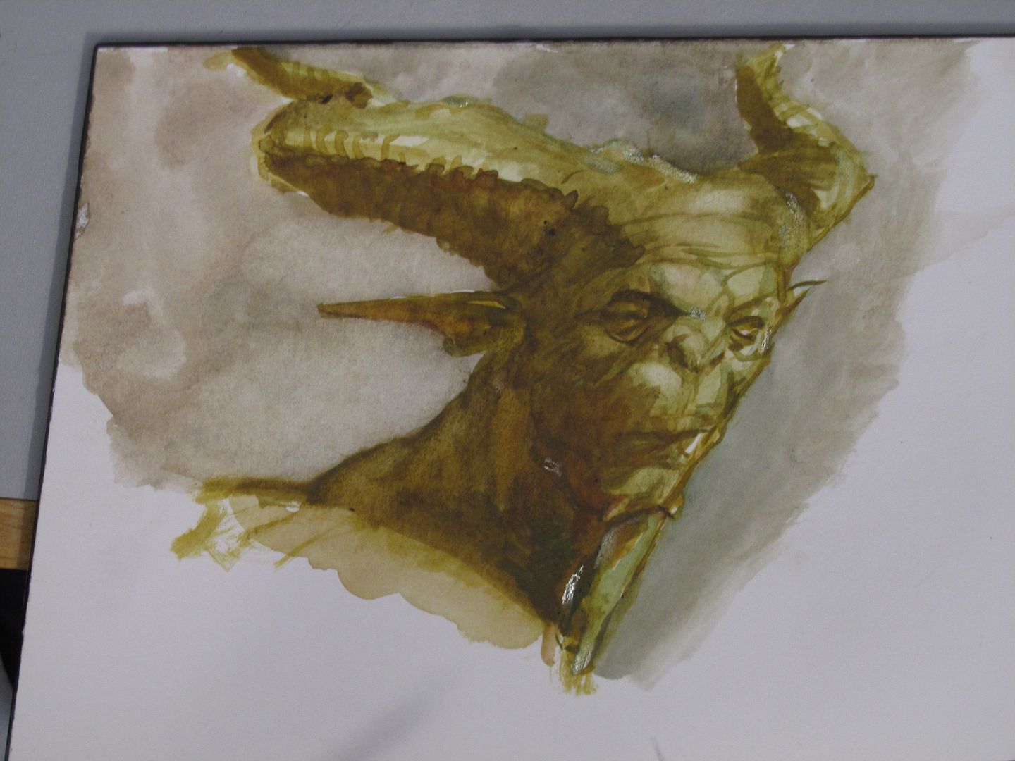
Between lectures and painting time with instructors going around, and the meals at the Amherst College dining hall (which are great meals, by the way), there are impromptu demos. Here, a student asks Iain McCaig (most known for doing the concept art for Darth Maul, etc.) for help with a demon face and Iain starts painting...
using watercolors--
Sorry... I never seem to catch these things at the very beginning, but I think he just goes right into the painting/sketch. He has one of the students stand so his head is at the right angle. And he's also glancing at the other student's original sketch of the demon (although he's deviated from it quite a lot).
He washes a shadow in, seeming to obliterate a lot, but...
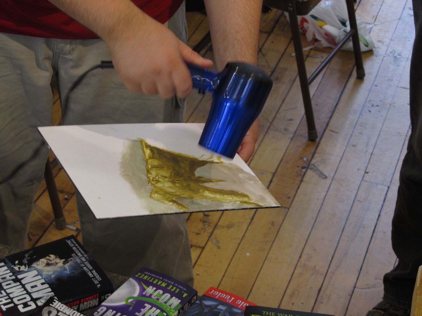
Break for drying (one of the students supplies the dryer and actually dries it for him--
He uses water to pick back up some color to make highlights.
Many years before (a good decade or more), he was a guest at a con. At the time he was doing all water-colors in the English style rather like Froud and I remember him talking about using bleach to get back to the white of the papers--so I ask him about it. I'd mentioned this to others and they'd scoff and say it would yellow the paper, but Iain says he DOES use bleach and just makes sure to soak it back up with water, so it doesn't eat/yellow the paper.
Doug Gregory, AD for Blizzard is on the left, looking on, with Greg Manchess on the far right--
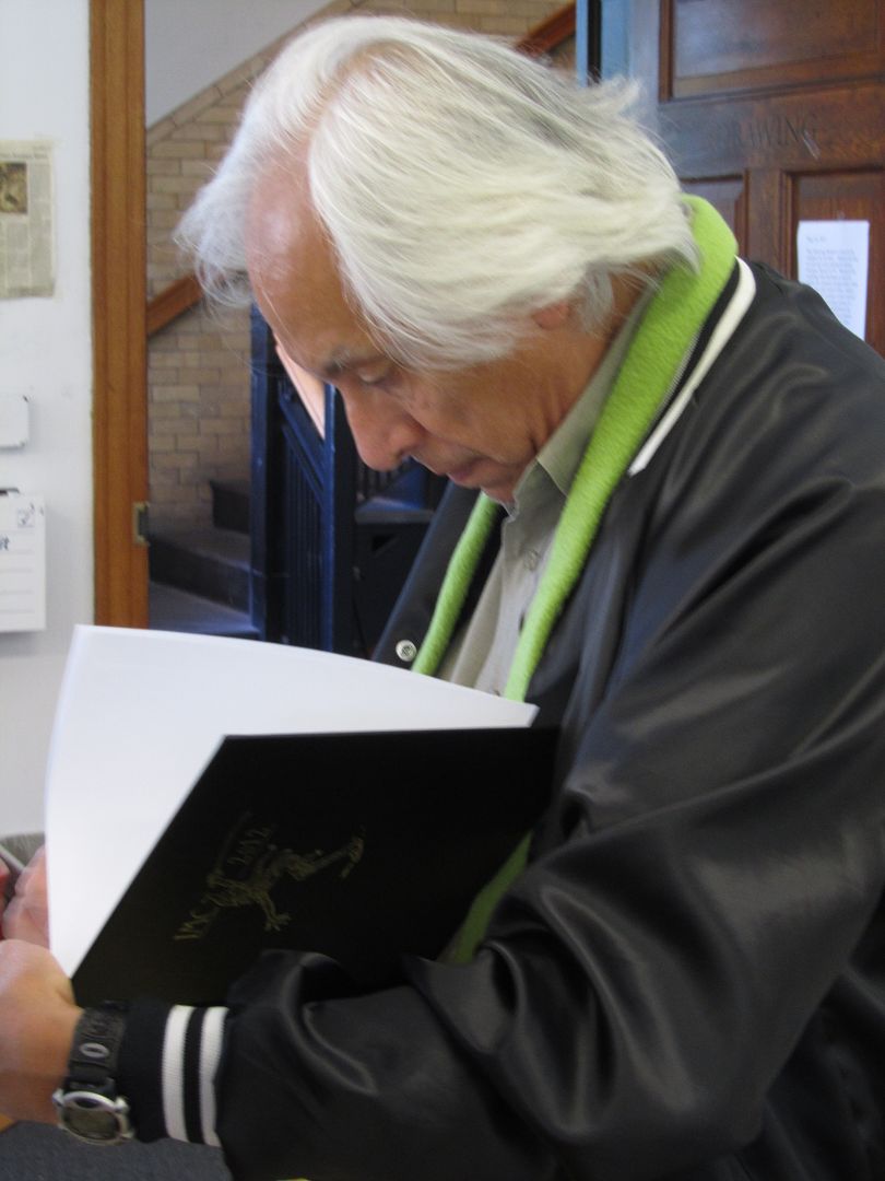
Iain signs the sketch for the student. So cool! ^___^
... more stuff to come from IMC 2012...
Subscribe to:
Posts (Atom)